Screenshot / Behind The Phoenix - Year 300
-
 26-November 17
-
 Knoebels Amusement Resort Recreation
-

 15 of 18
- Views 1,594
- Fans 1
- Comments 13
-
 Description
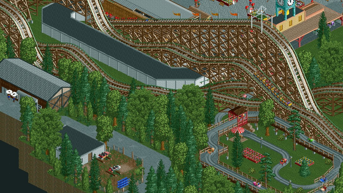
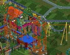
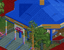
Posting a screenshot in celebration of hitting year 300. Park is full and has entered the fixing/updating/revising phase. This may be the last screen I post from this park...
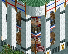
Bonus: There's a cool little Knoebels easter egg in this screen. Figure it out if you dare! (Coasterbill is banned from this competition so others have a chance... =P) -
 Full-Size
-
1 fan
 Fans of this screenshot
-
 Tags
Tags
You're consistently improving with each and every screen. I am really liking where this is going, mate! Keep it up!
You've officially earned your first sg. Congratulations.
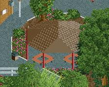
The two employees on a smoke break is a phenomenal detail.
Also, the rocket car looks like it's a leftover from Jet Star, as does the Arrow car from Whirlwind.
I really like the look of that car ride. Would be quite spectacular to ride with the big coaster soaring by next to it. The layout of the wooden coaster is kind of strange, not sure whether I hate it or love it.
Ding ding ding! We have a winner! I thought it would be fun to somehow include some Knoebels history. Glad you figured it out! Both rides were relocated and are still in operation, so there probably wouldn’t be leftover cars irl, but this is a game and I can do what I want.
This is your best screen. Good realism work. The smoking employees are indeed a great detail to include. Keep this up Saxman.
The little details you're starting to add are the things that will really take your work to the next level. Great stuff.
Looking good. I feel like you're entering the phase now that nitpicking will be helpful, so here we go: the smoke from the smoking employees should be grey, not white. The object is very light already, grey will appear as white. Making white light will only make the object lose it's texture, and make it stand out more than it should. After all it's only cigarette smoke. Or weed. Maybe one of those vape things?
The buried pine tree on the right looks surprisingly good. I (or someone else) should turn that into an object!
Good, would be better without that white building crossing under the wooden coaster though !
Love the two employees smoking too.
It's a recreation; there's a tunnel under Phoenix before the lift.
Looks wonderful, I agree with Liam about the smoke color.
You're certainly getting better and better. It shows.
I do have some concerns though.
First concern being the foliage. I'm not sure about the mix of textures. Since the foliage I make tend to suck, I'd recommend to have a look at parks made by SSSammy, Liampie, and Faas. All very knowledgeable in the foliage "department".
Second concern is the amount of grey. Even if this is a recreation, and many things in real life are grey, they don't necessairly have to be grey in game. Sometimes other colours are more suitable.
Good work regardless. Keep working hard!
Thanks all! I appreciate the comments, compliments, and critiques. It's fun to see all of your responses, one of the main reasons I've been so motivated on this project. Now, for some individual responses:
I will for sure change the smoke, I agree that it stands out too much as white. I was surprised that pine tree worked as well as it did too, I've done it a few times in this park where I needed a Christmas tree-ish object.
This is a recreation, so you could actually ride the car ride if you wanted irl! It is a pretty fun ride, and you certainly do get a ton of interaction with the Phoenix. As for the Phoenix itself, it's the best I could do in game with the figure-eight double out-and-back layout of the real coaster. I think its a good compromise of recreation looks and in-game looks. The double up/down feature prominently here is a signature element of that coaster. The second down literally throws you out of your seat, because this coaster has only buzz bars and no seat belts.
I'll have to do some more research on the foliage. I got some good compliments on it on my previous screen (the log flume), and I thought I landed on something that was unique and matched the forest in and around Knoebels, but I'll have to check it out and see if I can improve it.
As for the grey, yes, this park has a lot of grey, which isn't helped by the fact that the pathing is now all grey (albeit two different textures now). For those who have commented before, the yellowish off-white path is now gone, replaced with white-colored mulch (which looks more grey in game than white).
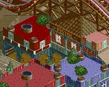
I think the car ride in this screen can be changed to brown track, the maintenance building roof can be changed to something else (maybe the muted red) and that would help a lot.
Unfortunately, this building is not very pretty IRL. I may try to spruce it up by adding some more detail to the roof and some grass/bushes around its base. Otherwise it's going to stay largely the same.
brilliant! i liked it when it was green, i like it now its brown. i just like it.