Screenshot / Mirage Islands 2 - Korea
-
 25-November 17
-
 NE Multiplayer VI
-

 3 of 6
- Views 1,579
- Fans 0
- Comments 9
-
 Description
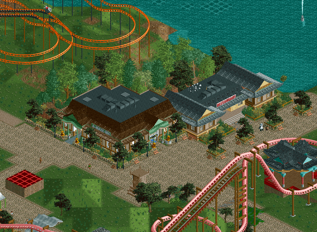
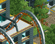
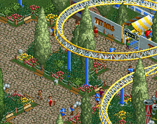
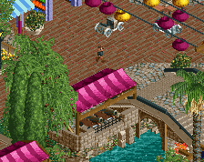
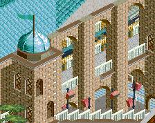
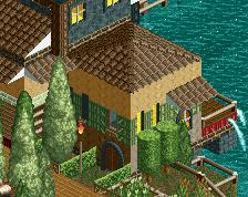
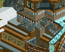
Another Day, Another Update. Korea has received an update recently with the addition of 2 lovely buildings shown here. Left is "A-Maze-Ing" housing a maze (mirror-house/maze?) and Right is a restaurant. As always let us know what you think below!
-
 Full-Size
-
 No fans of this screenshot
-
 Tags
Tags
Love this! This park is progressing real nicely now.
Yeah this is really good. I've been looking forward to this area.
It looks good, but I don't think it fits with the rest of this area or what ][22 had originally planned. This looks much more 'theme park-y' by basically having the buildings as just a facade, compared to the rest of the buildings in the area that look authentic, themed the whole way around, without any flat roofs or ventilation.
I agree with trav. I also think the path is a little bit boring.
be careful not to overuse those trees! they will get old fast!
There are some odd texture choices and such here, but overall probably your best work so far.
Good point.
I'm not sure I had any ideas left for this corner, honestly.
A maze looks prettier than a black flat roof... so why not make this an outdoor ride? Also, rotate your trees when you place them so they don't all point the same way!
Pretty good. Definitely feels Asian/Korean to me, so props to that.
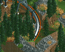
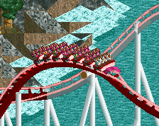
For some reason, I really like those *coaster colours and the bits of layout I can see. *Inverted coaster