Screenshot / Seas of Antiquity: Andalusia
-
 20-November 17
-
Seas of Antiquity
-
2 of 14
- Views 1,572
- Fans 0
- Comments 13
Community Forum Software by IP.Board


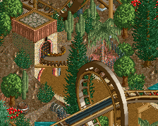
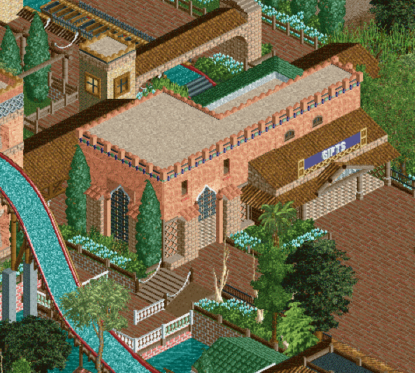
Tan roofs is a no. Zoom level is also a no.
I think you can do a lot better.
The zoom level is only because of the crop. And I absolutely love the tan rooves.
Maybe if everything else wasn't already tan. There's just no contrast, everything blends together.
Does everything need to "pop" or contrast though?
Actually, this close up is very nice. Good colours, plus there is contrast: the peach and teal are lovely pops.
^Agreed about the colors... this is a nice screen. Also, I like the roof colors because grey or black seems like it'd contrast too much and make the building look top-heavy. Really nice archy though.
I would add more than just the brick path though... that plaza-looking area seems like it could be a bit monotonous with just the brick path.
Looks pretty good to me, just like Andalusia (from my Google image search).
i like it
Beautiful but I think there isn't enough things to look at.
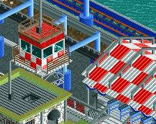
This looks good too, but a bit lifeless compared to the other screen... Might just be the sea of path in front of the building, though.
Tan roof looks good to me, but I'm not so sure about that white balustrade by the water...
I think it's totally gorgeous. Smells of SA all the way which I love.
I agree with Posix ^ Lovely, lovely screen, there, Shogo!