I like most of this (especially the placement and interaction of the twist with the plaza and queue), but the diamond in the plaza is dragging down the entire screen. It seems too large and unrefined to me compared to everything else. Can you use quarter tile objects to give it a more unique shape?
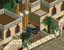
I like the path, it's different and stands out for a nice ride entrance. I'm more worried about your actual station design. We can't really see whats going on up there except this one side. I hope you dont make it tooo big
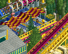
I think you should delete that one tree hiding the entry/exit of the zero g roll. Otherwise the mix of colors and texture is very nice but needs more finish indeed.
 20-November 17
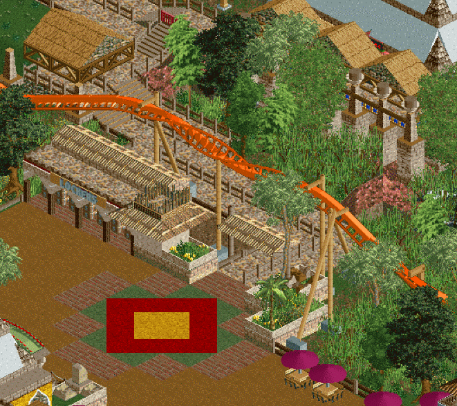


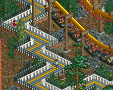
Needs more finish, and you know my thoughts on the plaza thingy.
Vertical supports seem a big flimsy too.
the green path in the plaza is disgusting. Also i think that roof shouldn't be defying gravity (in other words finish screens).
dang
edit: I actually like the green path a lot. It adds some variety to an otherwise orange palette.
Is this an older bench though? It feels dated. Not sure if it's the lack of finish or what, but it doesn't feel up to par with your recent work.
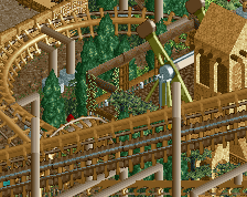
Its half protour 1 half fisch
I like most of this (especially the placement and interaction of the twist with the plaza and queue), but the diamond in the plaza is dragging down the entire screen. It seems too large and unrefined to me compared to everything else. Can you use quarter tile objects to give it a more unique shape?
i like it
I really like this
I like the path, it's different and stands out for a nice ride entrance. I'm more worried about your actual station design. We can't really see whats going on up there except this one side. I hope you dont make it tooo big
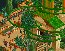
I love the object choice, I love the queue and queue covers. I love the interaction and I love the locker building.
I hate the plaza pattern and the red square. Looks like you added it with MS Paint.
I think you should delete that one tree hiding the entry/exit of the zero g roll. Otherwise the mix of colors and texture is very nice but needs more finish indeed.
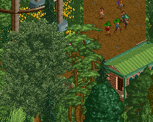
What's with the weird, grainy resolution? Looks amazing, though!
The station is visible from more angles, so i think partially hiding one won't hurt anything.
im fine with the green in the plaza but i hate the yellow/red combo. its so distracting to me. you know what you're doing tho
That path plaza is so relentlessly ugly.
But partially hiding it from the guest perspective?
This looks great. I am very excited to see where this goes!