Screenshot / Expedition Mars
-
 06-November 17
- Views 1,562
- Fans 0
- Comments 3
-
 Description
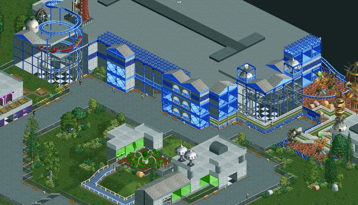
After my last project is pretty much 90% done, I needed a bit of variety and decided to start a new project. It is a 190x190 park with a focus on theming and landscaping. What bothered me the most at my last park was that it was extremely flat, that's exactly what I'm trying to do better in the current park.
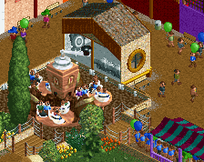
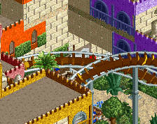
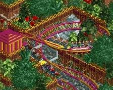
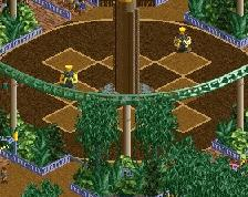
But you do not see much of it here. What you see is the indoor coaster: "Expedition Mars", the flat ride: "Invasion" and on the left the "Space Cafe". -
 Full-Size
-
 No fans of this screenshot
-
 Tags
Tags
The layout
The coaster's building looks decent, if anything a bit barren on top. I think the weakest portion of this screen has to be the flat ride's building. It's very bland and hard to look at. Try adding more details onto your walls and buildings. Layering your walls more and using angled fences to line roofs and add decoration would be two ways to definitely improve this area. Looking forward to seeing the rest of this.