Screenshot / MM: Jungle Lab
-
 02-November 17
-
 Mundos Magicae
-

 6 of 7
- Views 2,101
- Fans 1
- Comments 7
-
 Description
Expedition: Mystery Mountain. Years ago an expedition went into the jungle looking for proof of an ancient monster living inside it. They never returned. Now, a new group of courageous scientists wants to know the truth. Join in them journey....
-
 Full-Size
-
1 fan
 Fans of this screenshot
-
 Tags
Tags
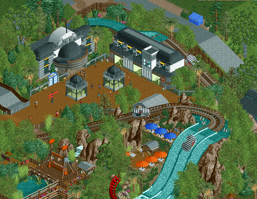
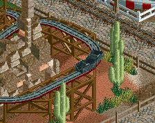
This looks pretty great! That drop seems rather steep for the type of boat though.
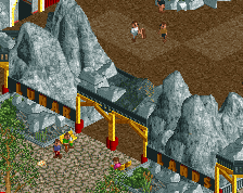
Pretty awesome using the Jungle Cruise boats on anything but level track. That drop would be absolutely terrifying. Curious to see what the red track is for, and are those exhibits or weird science experiments?
I really like the juxtaposition of themes here, it's definitely unique. I think you can find a better "No Entry" sign tho, and maybe sprinkle some shrubs and grasses along the path edges so it's not so square.
I think you can hide and manage your backstage roads better. Overall, your just missing out on that extra level of depth and detail that would put this over the top. Make sure to take your time with stuff like this, if you truly want it to be special, you're almost there.
Ahaha! Fitzcarraldo! Brilliant!!
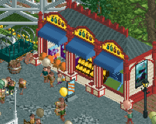
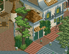
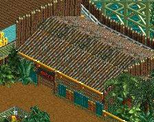
Some of the buildings look a bit too small in my opinion. But nice idea of using those boats, I would love to ride that haha!
What really has me interested are the architectural structures. But you came up with cool structures and then placed them in a very linear shape. It's a waste. Keep up this type of architecture and make it less linear, more diverse. It'll lift the archy up from 80% (innovative but too flat) to 95% (innovative, and interesting in shape). Not that you really have to do that here, but keep it in mind if you build more of these or if you come across similar situations in the future.
I agree with Julow in that I think actual water objects to the sides of the main drop wouldn't look worse than that triple drop. Can't say I love them either.
Definitely great ideas overall once again. You're a very smart and creative player, man.
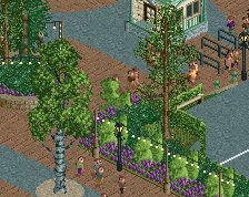
Pretty cool! I really like the foliage here. I also like the seating areas. Architecture is kind of different and interesting. That's a plus.
I don't like the triple water drops either. I understand what you are trying to do but I just don't think it works that well. I pretty much agree with Julow here.
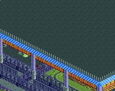
Also I would recommend to use flat roof textures for the circular shaped roof to avoid the glitching.
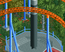
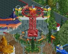
Lastly I would suggest to find another fence for the top spin queue. The double layered wooden fence doesn't work in my opinion.
All in all I think this is a clear step in the right direction. Good job.