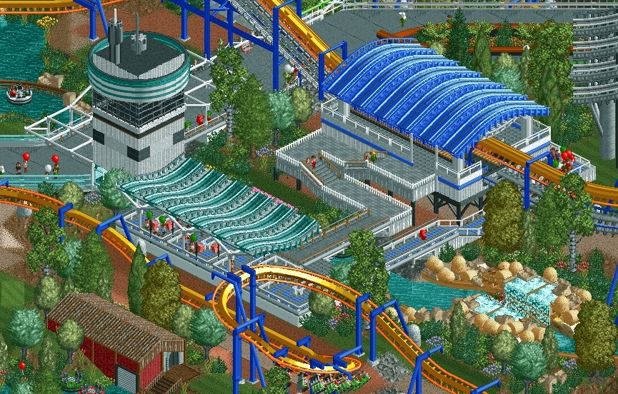
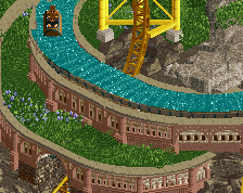
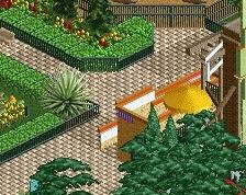
Very good indeed! The rapids passing by the queue and station is nice, and the use of the tower platform for the queue ramp is really good! Nice work on the station roof, with that hint of giga coaster track as support structure showing at the end! Pleasant colour choices and foliage.
Dude, when did you get this good? Honestly more and more impressed with each screen you release. Maybe needs some more variation in the roofs, but this is on an entirely different level than the work I've seen you do before. Looking forward to seeing more.
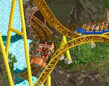
Very lively, drop tower flooring is genius for the queue. The only thing I can really think of that I'm not keen on is the height of the control tower (seems a tad squat, but that's a very, very minor nitpick) and possibly the color of the coaster. Again, very minor and possibly not even worth changing. Well done.
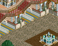
I'm loving every bit of this, there's so much innovation. The drop tower antenna, the exit path drop tower floor, and the tennis netting window framing all work really well here. Only suggestion I have is that you use the tile inspector to fix the draw order of the monorail and invert track on the lift.
 30-October 17

Wow I absolutely love every single bit of this.
This is wonderful! Love it.
Very good indeed! The rapids passing by the queue and station is nice, and the use of the tower platform for the queue ramp is really good! Nice work on the station roof, with that hint of giga coaster track as support structure showing at the end! Pleasant colour choices and foliage.
Love it!
Dude, when did you get this good? Honestly more and more impressed with each screen you release. Maybe needs some more variation in the roofs, but this is on an entirely different level than the work I've seen you do before. Looking forward to seeing more.
hpg Fan Offline
I like it a lot.
Very lively, drop tower flooring is genius for the queue. The only thing I can really think of that I'm not keen on is the height of the control tower (seems a tad squat, but that's a very, very minor nitpick) and possibly the color of the coaster. Again, very minor and possibly not even worth changing. Well done.
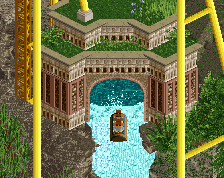
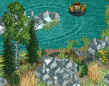
someone figured out that flying saucers look good underneath stations
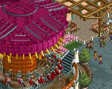
This is just so awesome. I love the control tower and the queue awnings are cool too.
Just such an interesting aesthetic; full of cool and refreshing ideas!
The coaster looks a bit clunky but, maybe its just this screen. Also maybe harmonize the foliage a bit more, u have a few too many tree types imo.
I'm loving every bit of this, there's so much innovation. The drop tower antenna, the exit path drop tower floor, and the tennis netting window framing all work really well here. Only suggestion I have is that you use the tile inspector to fix the draw order of the monorail and invert track on the lift.
This is your best screen without a doubt. There is so much innovation here, it just makes everything so much better!
Do more of this!
Very well composed ! Trackitecture done right, very clean work.
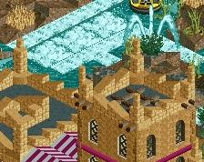
I'm not really sure about the white awnings near the control tower though, from this angle it looks a bit weird.
Otherwise very solid work !
very clean and well done. lookin good
stunning
Impressive stuff. Looks very good. Wish you well on the AP voting.