Screenshot / Halloween NCSO Design
-
 28-October 17
- Views 1,782
- Fans 0
- Comments 8
-
 Description
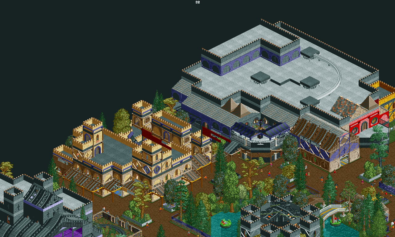
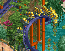
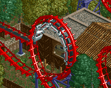
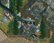
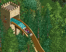
This is the first of a few screens of my recently endeavored Halloween Design & contest entry.
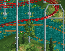
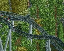
Most of what you see here is completed. It is mostly the rapids ride that is not. Tips and pointers always welcome! Enjoy!
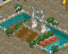
Note: The huge building is home to a Gerstlauer dark ride known as 'Black Hole' in this design. Also, that odd building in the middle of the 'pond' is a Merry-go-round. -
 Full-Size
-
 No fans of this screenshot
-
 Tags
Tags
Oh boy this is good. It's very clean and the paths look amazing. Perhaps your best screen yet.
it's not very clean or cohesive. it seems like you dont know what exactly you want to achieve aesthetically. getting a better picture in your mind will help you a lot in terms of getting your ideas all together.
some of the forms are overdone, like the merry-go-round. the ramparts block the octogonal form of the carousel. your details are good though and i am loving that roof structure on the left.
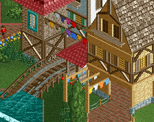
I like the architecture of the two buildings on the left, but the big building on the right looks somewhat unplanned. The red and the gold do not fit into the theme, just like the rooftops of the pirate theme and you use too many different walls and other objects. Concentrate on a few walls and roofs which fit into the theme per building and give them meaningful details. But all in all solid work, I like it
I kinda agree with Shotguns.
Anyways, I really like your work, it's very interesting.
What the heck. If you all are saying this is really quite good, why is the rating at 47% with three votes? Earlier, with one, it was at 30%!
Help me out and upvote this, because that's BS.
I think your issue is that you're cramming too many large buildings right next to one another, so there is no room to breathe., especially how they crowd the paths so heavily.
Tbh, you need to do less.