Screenshot / Stealth
-
 01-December 13
-
 Thorpe Park
-

 8 of 9
- Views 5,223
- Fans 7
- Comments 18
-
 Description
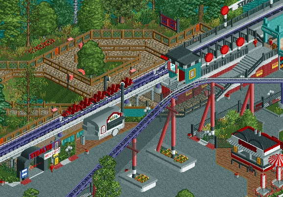
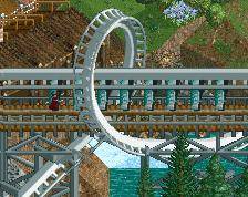
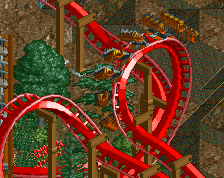
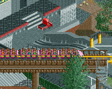
Dominating the Thorpe park skyline, Stealth is a 150 foot launch rollercoaster that pushes your body to 70 miles per hour in less then two seconds.
Stealth may be Thorpe Park's shortest ride but its impact will last longer then any other ride. -
 Full-Size
-
7 fans
 Fans of this screenshot
-
 Tags
Tags
Whow, looks amazing! Dunno but it could use some more lamps and stuff. Also, the red stoplight-ish things look weird tbh.
And omhgghhh so much tags :S
Well done.
Spot on! Instantly recognisable and very well executed.
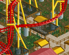
love the food van, also everything else
Looks really cool!
The queue line doesn't seem to fit with the coaster surroundings but I don't know if that is because it is a recreation. I've never been there.
Yeah Faas, I think it's quite true to the actual ride. The queue kinda winds its way through a near-swamp area, right next to the bank, and isn't themed appropriately at all.
Looking accurate, nice. I think you could get away with making the slanted supports that go to the ground black instead of red, to match the vertical black and white. If you needed to, make another vertical support white to match the lengths of each side.
This has come along so far, and I'm immensely proud of you. Watching you work on this everyday is an incredible experience. I knew that the guy who created Paramount's Great Lakes would finish an incredible park one day <3
I like the <3 tag that Louis! has been adding to everything.
Looks very real. I can definitely imagine myself there, even though I've never seen the park. I kinda agree with Wouter about the red signs though, because I'm not sure what they're supposed to be, but I think they look good anyway.
Airtime Offline
Thanks for the comments.
Chocotopian is right. In reality, Stealth's queue is different to the rest of it's area. The queue meanders around a swamp like area that used to be Thorpe Park's Sunken Gardens.
Love the idea for the brake fin.
Really nice job.
Ironically.... Its called "Stealth" yet I can see it very much.....
Happy N*@$R Year biatches
I think s_f was drunk.
This is outstanding.
i don't care about necrobumping this. i'm gonna kanye this shit and say that i <3 this screen tons. the coaster frames everything so well and you spared no expense in making cost-effective, balanced theming with harmonious color usage.
This looks so nasty! Nice shit!
^out of context, that phrase is way more interesting.