Screenshot / Maze Palace - Big Woodie Station
-
 25-October 17
- Views 1,675
- Fans 1
- Comments 7
-
 Description
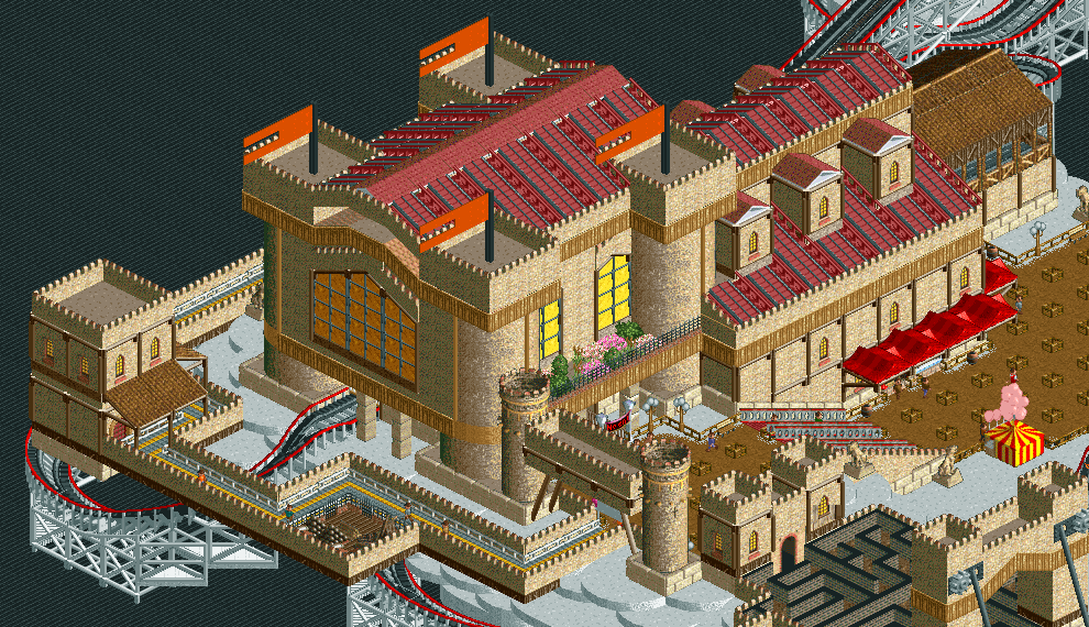
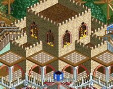
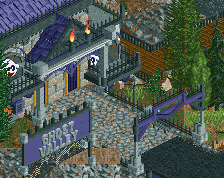
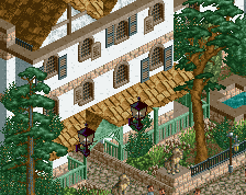
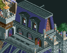
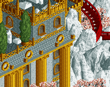
Maze Palace, my entry for the maze contest from the Discord server RollerCoasters and Friends. I didn't have time to finish it, but I completed it enough to enter it. Right now, I'm re-working on it, and I don't have a lot to do before releasing it! :D
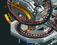
This is the remade version of my big ass station for my only coaster in that park. Not planning to do any other modification on it. -
 Full-Size
-
1 fan
 Fans of this screenshot
-
 Tags
Tags
![screen_3797_[Disaster Bench] Arcan Grove Preview](https://www.nedesigns.com/uploads/screens/3797/3797_thumb.png)
I quite like how you put this area together, you definitely show a great feel for the game as always.
Coasters colours are a bit meh.
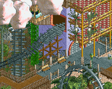
Surely something more interesting can be done with the path trick leaving an almost planter-esque opening, I get this is NCSO but maybe some 2x2 custom trees could work in those small spaces or just anything to use those gaps in path
Very clean. Needs some green though to contrast with the tan.
I like the idea but in my opinion the castle is a bit too massive and the brown doesn't contrast very well with the rest. It's a bit too square compared to the "clouds". I like the maze though.
I actually wish the castle tower was a bit bigger. Agreed with Stoksy on the paths and coaster colors; but it's very clean and looks nice.
You already know my thoughts about the woodie colours and roof colours, so I won't hash those words out again.
I agree with Stoksy about the path gaps, and I am not the biggest fan of the path.
I love what you did with the map though. Shows some really creative architecture such as the windows; that, I might have to steal.
I find this pretty good, but it could be improved.
Quite impressive. I really admire your ncso. Especially your build in the survivor contest. You have great talent! This screen is good too. Those glas windows are a really nice touch.
I think I need more context to fully appreciate this. But what's there is really good.
As mentioned, the coster colours need some sort of change. Keep it up!