Screenshot / Entrance Plaza
-
 18-October 17
- Views 1,854
- Fans 0
- Comments 11
-
 Description
Hey peeps,
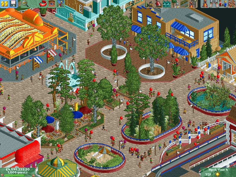
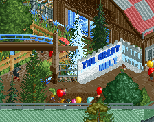
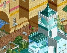
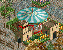
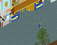
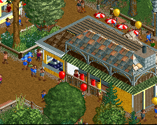
been a bit busy the last coupla weeks but I've managed to complete the main entrance plaza to me park. since this park is based in Cornwall I decided to give it an English seafront feel to it. rides include dodgems, Carousel (green and yellow building) and the energizer (you'll have to see that in a future screen). shops include an arcade, fish and chips, a souvenir and clothing shop. Also fitted some lockers in the beach huts! More to come -
 Full-Size
-
 No fans of this screenshot
-
 Tags
Tags
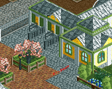
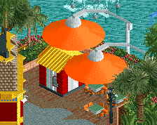
I like those planter boxes!
The curves all clash with each other. The foliage is inconsistent and the shapes feel very perpendicular and kind of jarring.
I'm also not sure I understand the 4d roof.
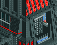
I like the paths and what I can see of the big building in the bottom right.
I'll have to agree with inthemanual about the curves. I don't mind the off centered park thing in the middle, but the white planters aren't aligned with the brick path and its a little off-putting. Should be an easy fix tho.
The foliage does need work, there's too much variety and nothing is consistent.
The individual structures are nice, however. It's a pretty good screen even with it's faults. I'm excited to see more.
I do like the architecture.
Keep the ground elements asymmetrical. It adds to the realism of the park.
PS. Look at a 100yd stretch of pavement around any UK road junction and you can see that whilst Britain has the superficial appearance of a unified plan, it's really just a melange of thousands of years of patchwork and make-do.
Circular planters at the top need to be filled with something other than dirt.
Rest is solid, but I think replacing the tan path with something a bit less textured would help tremendously.
I like the textures.
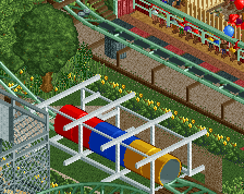
The asymmetry doesn't bother me too much either, but the planters are horrifically ugly, and like Liam said this lacks cohesion. Why is there a desert in one planter, a swamp in the other, and the first thing peeps walk into is a planter within 1.5tiles?
I'd ditch, and completely rethink the dull red, blue, and white planters because none of them make sense. Once again, tonne of stuff going on but it doesn't come together into a pleasant viewing experience (unfortunately, like basically all of your work)
Very nice!
I agree with the general consensus of the planters. Otherwise, with some improvements, this could be some really insane stuff!