Screenshot / Ellison Lake - Splinter
-
 09-October 17
-
 Ellison Lake
-
 1 of 5
- Views 2,403
- Fans 2
- Comments 9
-
 Description
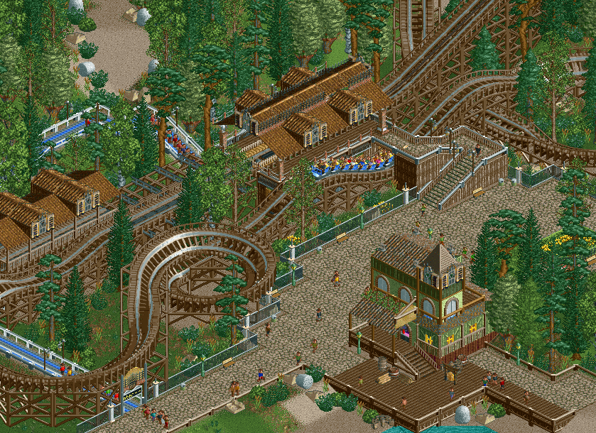
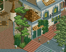
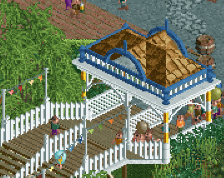
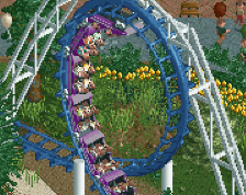
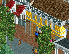
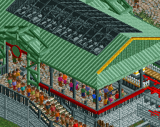
I decided to start another park next to Mundos Magicae to keep things interesting for me: Ellison Lake! This is gonna be my very first NCSO project after the multiplayer thing. Some of you might already have seen some screens from it on the Discord. Its gonna be a typical American lakeside/woodland theme park and this is what I've got so far apart from the entrance that still needs some work. I could use some tips for this park as I've never tried to do NCSO on this scale before.
-
 Full-Size
-
2 fans
 Fans of this screenshot
-
 Tags
Tags
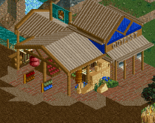
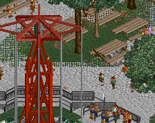
This is really nice, if a little dull. Flowers, coloured trims and awnings would go a long way.
The other thing that immediately jumps out is the lack of structure on the station roof and transfer shed. I'd add some poles along the edges as well as a couple more columns.
Also get rid of the gum rocks!
I agree with alex about the station roof, but other than that I think it's pretty much perfect. I love how the coaster dives under the exit path and then goes into that small helix.
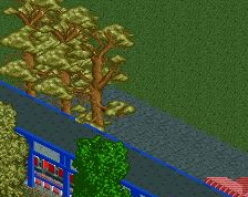
Maybe replace a few of those greyish "Monterrey cypress" tree with something else, greener.
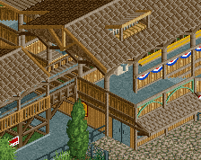
try doubling up the wooden rooves and putting the fence pole on the edges.
Needs flowers and color, but I love the look of this. Very nice.
I think the gumdrops work in the back, in that little clearing, but not up front by the boardwalk
This is fuckin' lit. I want this in my title sequence.
Thanks everyone for the nice comments!
@alex: there are more flowers in this screen. Problem is I forgot to water them... This being NCSO, they don't stay nice themselves. I should've ticked off the box in the cheats menu. I've modified the station a bit and added more columns. Not sure about the gumdrop rocks as well. I think I might do what tim said and get rid of them in the front but keep them in the back.
@mintliqueur: Pretty much perfect? Dang, that's a lot of praise! You're making me blush. I don't think I'll replace that tree though. i like it and it balances out the other sort of greens IMO.
@Shotguns?: that's a neat trick! I'll try it. Great to get tips from one of the NCSO masters.
@RCT2day: I'll add some more, thanks.
@inthemanual: see response to alex
@spacek531: well you're gonna have to wait! It's far from finished! But when it's done, I'll be honoured to have this in the sequence!
My slightly nitpicky comment would be that there are no path awnings. Adding some of those even in the lightest purple would help tremendously for atmosphere and its colour lacking problem.
Heck, missing a few vibrant colours is not going to kill me off of this project. I am really interested into seeing where this goes!
So good. Would be interesting to see the rest of the layout. The station building roof seems a little undersupported though.