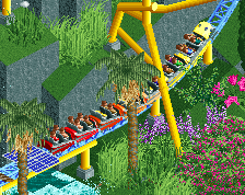
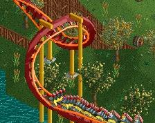
@pierrot: too much staff? Because of LL not having peeps I always try to add as much movement as I can with staff. And for the screen I grabbed a bunch of extra staff, so in game it will be less.
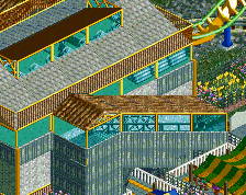
@Poke: I don't disagree with the chaotic feel. That's partially the result of me making stylistic choices for the entire area in 2011. I've touched up some things, made modifications, but some things are virtually irreversible without making it a painful process and/or tearing down half the area. I tried to fix it by adding things, paradoxically. Anything purple or pink, or any path awnings, as well as the path pattern, are additions from the past few weeks and I feel like it has helped a ton already.
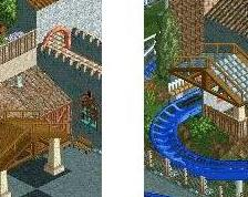
The only thing I'm not completely understanding is the blue and yellow monorail pieces. Is that meant to be a Ukrainian flag?
You recognised it as a flag, so that's nice to hear. The colours don't reference any real world place. I know it looks like Ukraine but I like the colours too much to change it.
 08-October 17
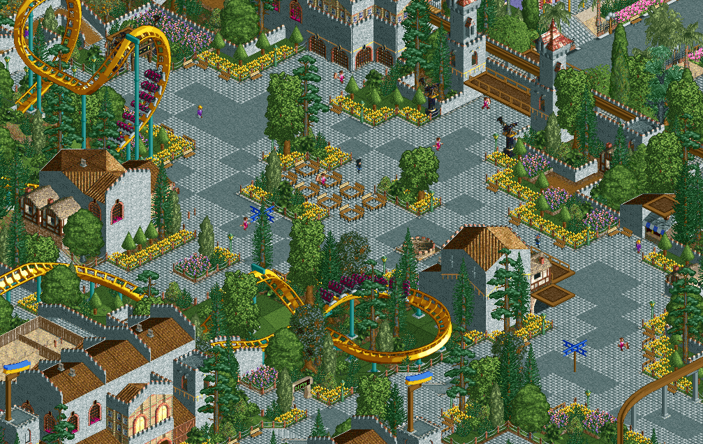
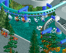
Now this, this is LL I love. Great stuff Liam!
Dope. The yellow and greys are so striking.
Everything flows so well. but I think staffs were placed too much in space(nitpicky).
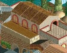
A lot of gray, but you made it work.
Not a fan of the paths, personally, but I really like this. Architecture is stunning, and I love how the coaster interacts with the path.
absolutely gorgeous in every way; the pathing, the flowers and little topiary trees. the purple flowers are also a lovely little touch.
perhaps a bit too much of a chaotic tone? the foliage i think could be stripped back a little in places. that's up to you though.
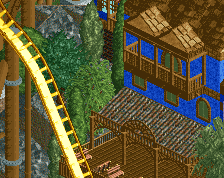
ye im a fan
hpg Offline
Dayamn that's some fine looking LL.
Thanks everyone!
@pierrot: too much staff? Because of LL not having peeps I always try to add as much movement as I can with staff. And for the screen I grabbed a bunch of extra staff, so in game it will be less.
@Poke: I don't disagree with the chaotic feel. That's partially the result of me making stylistic choices for the entire area in 2011. I've touched up some things, made modifications, but some things are virtually irreversible without making it a painful process and/or tearing down half the area. I tried to fix it by adding things, paradoxically. Anything purple or pink, or any path awnings, as well as the path pattern, are additions from the past few weeks and I feel like it has helped a ton already.
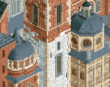
Incredibly classy. Love the sunken tower in the path, nice detail
Wow this is classic LL+
Normally I don't like LL screens because there's so much chaos, but this is really sleek. Nice!
The only thing I'm not completely understanding is the blue and yellow monorail pieces. Is that meant to be a Ukrainian flag?
Looks very classy overall.
This is so clean and clever. I love it, Liam. Please show us more!
You recognised it as a flag, so that's nice to hear. The colours don't reference any real world place. I know it looks like Ukraine but I like the colours too much to change it.
Beautiful
I think the flag colours are just fine!
I'm amazed how something so ridiculously grey can look so good and not grey. Amazing.
really well composed.