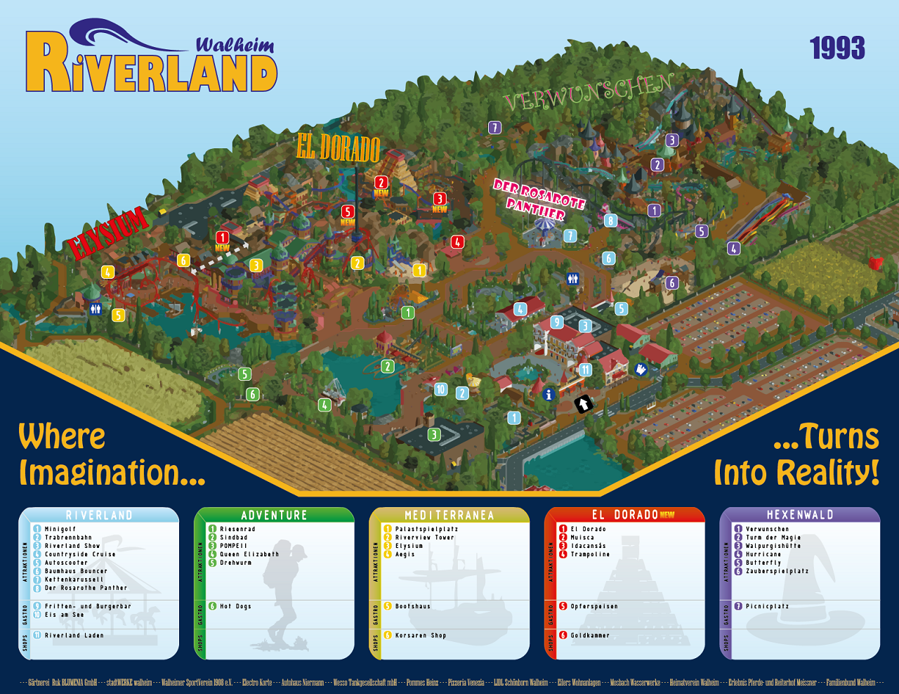
Screenshot / Riverland 1993 (update in comments)
-
 07-October 17
-
 Riverland
-

 16 of 17
- Views 3,049
- Fans 0
- Comments 14
-
 Description
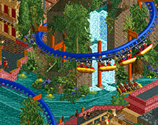
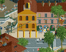
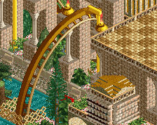
Welcome to Riverland's official 1993 season opening!
Today marks the first day that we open our new area El Dorado for our guests from near and far.
We wish you the great fun exploring the area, and testing the daring new rides.
your Riverland team -
 Full-Size
-
 No fans of this screenshot
-
 Tags
Tags
Wow love the design on this one!
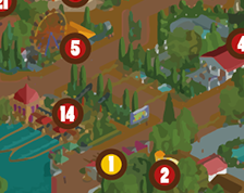
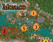
The illustration of the park map is too cool and reads great.
Looks incredible, Fisch. Very excited to see this in-game!
Holy shit, this is dope.
shopped
I will again say that this is absolutely incredible! Love. So much love for this project from me, Fisch!
Looks great FIsch.
hpg Offline
What's wrong with an overview/map like this? I agree screenshots that are taken zoomed out in-game look like shit, but I have no problem with something like this. If anything I'd love to see more parks include extra goodies like park maps.
Logo's really nice. Clean and professional but fun and not too sterile. I could easily see it being used by a real park.
Really like the look of this. The vector auto-trace is working really well with the game graphics, but it helps that you've paid excellent attention to your macro aesthetics. A lot of parks look like a bit of a jumbled busy mess when viewed from afar.
I don't much care for the typography in the info boxes though. It's specifically the small tracked out type that's not working for me at the moment.
This is really really cool! I don't even see it as a screenshot really, I just see a park map!
Thanks for the comment,s especially hpg, as these maps take really long to make. So I hope it's worth it and you guys enjoy them!
Well spotted hpg, it's the vector auto-trace that makes the rct screen look so different. I actually like the typography in the bottom, but that might just be something for right now. I might still change it for next time. It's especially interesting that the park is so readable from above. Certainly something I wanted to achieve for these maps, but I'm not sure it's something everyone would say about my work. A lot of people often find it to be too cluttered.
@Robear48: With Illustrator.
It's been 6 years since Riverland's addition of the El Dorado area in 1993. Long enough that we've all been wondering when the park is finally going to add something again. Maybe some of you still remember that leaked phase plan from years ago? [see Riverland project folder]
Well today a friend of mine who works at the park has told me that they've begun tearing down everything on a large area in the centre of the park. What are they working on?? It's roughly the area I marked out for you on this image:
GordoSam Offline
Ohh no. I really loved that area. On visits it has always been so nice and quiet there compared to the overcrowded newer areas of Riverland… Ideal for a midday brake.
On the other hand: excited to see what will become of the area!