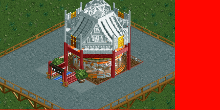
not sure if I like this as much as the other (I was one of the fans of the previous)- this seems sort of blocky and awkward, and it doesn't have nice foliage/elevation around it
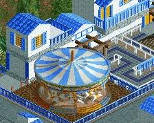
This roof with the old surroundings? Good job with the refinement of the top. I just think that the stark orange and red clash in this one, whereas the subtle red, yellow, green and blue in the other worked really well.
I also think the poles are ugly, they look weird. Roof looks way better now though, really like it. The barrel looks creative too, might use that myself.
 24-November 13


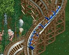
not sure if I like this as much as the other (I was one of the fans of the previous)- this seems sort of blocky and awkward, and it doesn't have nice foliage/elevation around it
I absolutely love it.
Beautiful!
(I would suggest using black or white to block the screenshot rather than the red, it detracts from the work)
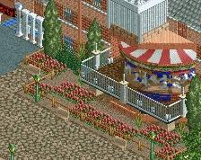
Now it's the base that's ugly and messy. The rest is definitely passable.
what you add around the base for it to look better
Try diagonal blocks on the corners? A diagonal fence maybe?
This roof with the old surroundings? Good job with the refinement of the top. I just think that the stark orange and red clash in this one, whereas the subtle red, yellow, green and blue in the other worked really well.
I also think the poles are ugly, they look weird. Roof looks way better now though, really like it. The barrel looks creative too, might use that myself.
If you made the roof black, you'd have the perfect asian carousel.
That's better. I would agree that the base needs work but I assume its unfinished.
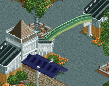
Does anyone know how he did that with the entrances and stuff?
He did not build the ride huts at all.
although i like carousel itself, i think that it's still lacks a lot of stuff, add foliage, fences around the carousel and all that stuff
Not only the entrances, but also like how the path actually goes into the attraction and it doesn't cut off. The same on the sides. How?