I actually really like the idea of a looping water coaster, but it just... doesn't look good. The color scheme on all the buildings are an eyesore, plus, as YoloSweggLord said, waaay too many track types for my liking. I voted 30%.
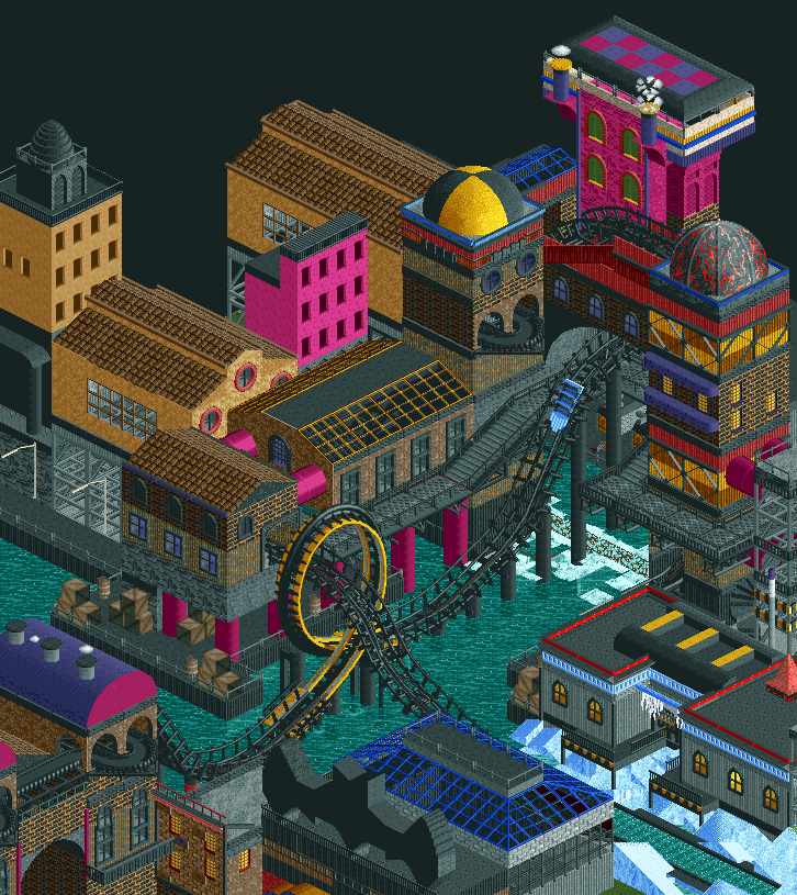
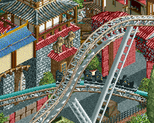
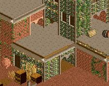
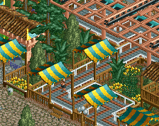
This looks really good! That woodie loop looks so good together with the heartline track. The object choices and relatively low level of detailing (in comparison to the "micro madness" of some of today's parks) gives this a decidedly retro touch that I like, but it could just as easily have looked rather dull had it not been for the colour choices which I think are very tasteful. Over all nicely composed as well! You seem to breathe a bit of new life into some of these older objects and this relatively simple way of using them... in particular those two building volumes made out of that old TT castle wall piece with the plain dark window opening.
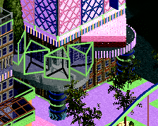
As always, I really hope there's more than one angle built into this...
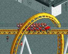
I disagree with the people saying the different tracks don't fit together, I think the looping and heartline track fit really well together. I think this looks pretty cool.
everything about this is really cool, the colours, the textures, the forms. and I think the coaster track looks really good. so much amazing stuff going on here!!
I actually really like the idea of a looping water coaster, but it just... doesn't look good. The color scheme on all the buildings are an eyesore, plus, as YoloSweggLord said, waaay too many track types for my liking. I voted 30%.
I understand this project isn't everybody's taste but don't you think 30% is a little bit severe ? Considering before you did that someone voted 75% ? Also it looks like you voted even less because at some moment the rating decreased even more without new votes.
inthemanual, on 30 Sept 2017 - 9:16 PM, said:
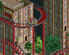
It'd look a bit cleaner if the woody track before and after the loop was solid black.
Thanks for the advice, I changed the colors and it's indeed better.
Thanks for the feedback everybody, yeah I'm sorry I'm terrible for descriptions. I will try my best to make it look good from 4 angles.
 30-September 17


Worst description ever.
that actually looks mint
I actually really like the idea of a looping water coaster, but it just... doesn't look good. The color scheme on all the buildings are an eyesore, plus, as YoloSweggLord said, waaay too many track types for my liking. I voted 30%.
I am totally diggin' this!
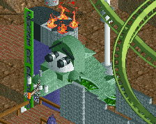
The pink seems odd to me. Batman villains have more of a purple/green scheme
"Badass superheros like Joker, Mr. Freeze, and others"
"Superheros"
Batman's "daily routine"
imlegos, on 30 Sept 2017 - 6:50 PM, said:
He's got a point
I facepalmed at "badass superheroes"
This looks really good! That woodie loop looks so good together with the heartline track. The object choices and relatively low level of detailing (in comparison to the "micro madness" of some of today's parks) gives this a decidedly retro touch that I like, but it could just as easily have looked rather dull had it not been for the colour choices which I think are very tasteful. Over all nicely composed as well! You seem to breathe a bit of new life into some of these older objects and this relatively simple way of using them... in particular those two building volumes made out of that old TT castle wall piece with the plain dark window opening.
As always, I really hope there's more than one angle built into this...
It'd look a bit cleaner if the woody track before and after the loop was solid black.
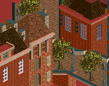
This is dope. Colours are so unusual but perfect for a comic book theme. It says batman immediately to me.
I disagree with the people saying the different tracks don't fit together, I think the looping and heartline track fit really well together. I think this looks pretty cool.
everything about this is really cool, the colours, the textures, the forms. and I think the coaster track looks really good. so much amazing stuff going on here!!
I like it too, nice work!!!
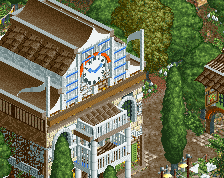
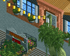
I always liked it from this angle. Now that it's finished it's even better. Great work!
Dombot, on 30 Sept 2017 - 5:11 PM, said:
I understand this project isn't everybody's taste but don't you think 30% is a little bit severe ? Considering before you did that someone voted 75% ? Also it looks like you voted even less because at some moment the rating decreased even more without new votes.
inthemanual, on 30 Sept 2017 - 9:16 PM, said:
Thanks for the advice, I changed the colors and it's indeed better.
Thanks for the feedback everybody, yeah I'm sorry I'm terrible for descriptions. I will try my best to make it look good from 4 angles.