CSW, Liampie, I now it can look a bit messy, but when you are looking to some parks you will see its not always that beautiful and clean, it's an elder park in *2013-2014 what i want to create.(if you understand me)
CSW, Liampie, I now it can look a bit messy, but when you are looking to some parks you will see its not always that beautiful and clean, it's an elder park in *2013-2014 what i want to create.(if you understand me)
Ok, but I'm sure there's another way to do the same without it looking so messy. The path in front of the entrance is just so weird. Do whatever you feel is best, though. It's your park and I'll love it anyway.
I agree with BG, its technically superior, but its so lifeless and unappealing. I think the main problem is your color choice. To many dull colors and tons of grey.
I think the color choices contribute to that lifeless quality. Even with peeps it would look dull. I agree that technically it is flawless, but it suffers from the same problem as gijssie1234's previous work: it doesn't feel lively and atmospheric. It always feel so dull and dry to the point where it looks like a different game than the one we are all playing. Stuff like Starpointe and Robbie's DCA feels like a step up from this because they actually have atmosphere and feel alive, with or without peeps.
I think the overabundance of black, gray, and white is what is killing the atmosphere. The pale green color is fantastic but it doesn't help either. Some brighter colors, maybe in the awnings or the details, the umbrellas, flowerbeds, fountains, rest spots with brick floor instead of tarmac, rocks in the planters, colorful flags or banners, signs, etc. That all would help with the lifelessness.
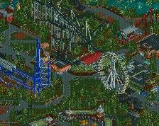
So many people complaining about this screen, but still voting it up to 91%.
I really like it. It looks very nice, but I can't imagine myself being there. I think it's mostly the path textures that pull me out of it. I really like that front-most building though.
I will look what i can do about the path textures, but remember, at the end there will be lights, benches,trash cans, food stalls,posters,billboards, etc. installed what makes it look even more better.
maybe that will make it more "alive".
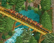
Maybe it's a lot of Grey, black and white on this screen, but if you go a little to the left or the right you will see some bright colored rides.
Also its a particularly style i want to show you guys, and I'm hoping you're going to like it
 24-November 13
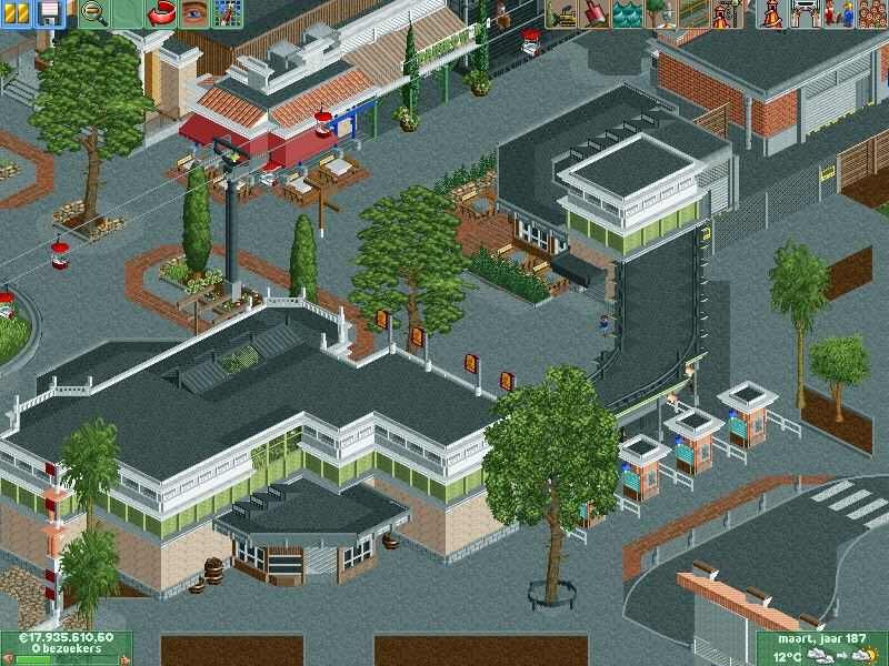
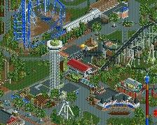

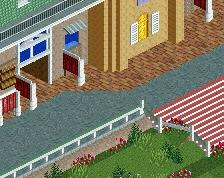
I'd like to see a bit more of the brick path, right now all the black and gray is drowning out the color!
Path textures are really messy in places... Not sure you want to much tarmac anyway. But everything else is ace. Really, really good parkmaking.
ho. ly. shit.
wow, every details are super clean.
it is an honor to use them brah *Coup
CSW, Liampie, I now it can look a bit messy, but when you are looking to some parks you will see its not always that beautiful and clean, it's an elder park in *2013-2014 what i want to create.(if you understand me)
Thanks everyone !
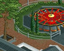
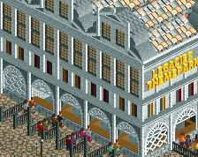
very sleek. love the flags on the building!
Incredible. Never seen anything quite like it.
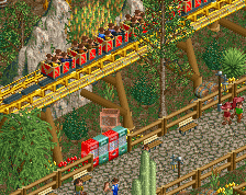
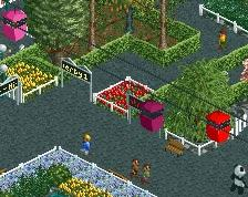
that palmtree placed wrongis a bit of an eyesore but for the rest it's again very technically great but it lacks something truly fun
Ok, but I'm sure there's another way to do the same without it looking so messy. The path in front of the entrance is just so weird. Do whatever you feel is best, though. It's your park and I'll love it anyway.
I agree with BG, its technically superior, but its so lifeless and unappealing. I think the main problem is your color choice. To many dull colors and tons of grey.
It's only lifeless because there aren't any peeps.
I think the color choices contribute to that lifeless quality. Even with peeps it would look dull. I agree that technically it is flawless, but it suffers from the same problem as gijssie1234's previous work: it doesn't feel lively and atmospheric. It always feel so dull and dry to the point where it looks like a different game than the one we are all playing. Stuff like Starpointe and Robbie's DCA feels like a step up from this because they actually have atmosphere and feel alive, with or without peeps.
I think the overabundance of black, gray, and white is what is killing the atmosphere. The pale green color is fantastic but it doesn't help either. Some brighter colors, maybe in the awnings or the details, the umbrellas, flowerbeds, fountains, rest spots with brick floor instead of tarmac, rocks in the planters, colorful flags or banners, signs, etc. That all would help with the lifelessness.
I think AC hit the nails on the head about the color.
So many people complaining about this screen, but still voting it up to 91%.
I really like it. It looks very nice, but I can't imagine myself being there. I think it's mostly the path textures that pull me out of it. I really like that front-most building though.
I will look what i can do about the path textures, but remember, at the end there will be lights, benches, trash cans, food stalls, posters, billboards, etc. installed what makes it look even more better.
maybe that will make it more "alive".
Maybe it's a lot of Grey, black and white on this screen, but if you go a little to the left or the right you will see some bright colored rides.
Also its a particularly style i want to show you guys, and I'm hoping you're going to like it
thanks everyone ! I appreciate your vote !
It's totally sterile and "made". It has no heart in it at all.
Hmm. I actually think that screen seems much more alive than his usual work, and looks like a well constructed and real entrance to a park.