Screenshot / Fantasy Valley
-
 18-September 17
- Views 2,205
- Fans 0
- Comments 11
-
 Description
Hello there, long time no see.
I´ve not died and SpreePark hasn´t died either.
Past couple of month I´ve been trying to rekindle my love for SpreePark by not building on the park and doing something else. Well, I might be about to start a new park as a distraction from the before mentioned goliath in the room and this might be it. Of course highly unfinished, but who would ever read to this point. I mean reading, right? So 2008 and stuff. Who can even read right now, I mean kids these days, come on... -
 Full-Size
-
 No fans of this screenshot
-
 Tags
Tags
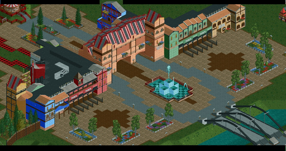
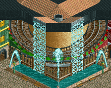
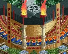
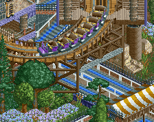
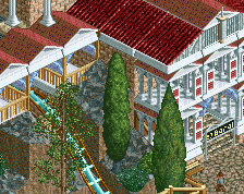
Why are the arches and roofs so uneven?
Edit: This seems likely to come across negatively, but I believe I'm missing some kind of abstraction, and curious as to what they're supposed to represent.
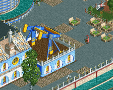
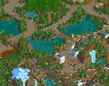
Whilst this project is quite nice, there are a few nitpicks from me. A splotch of path life here and there would help infuse the area with more life, I think. The scale looks rather large as well, a bit too large.
Otherwise, this is lovely. I am excited to see more!
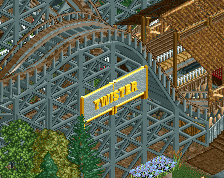
Bridge seems oddly small compared to the scale of everything else in screen. Archy looks fun, though!
I like the large scale. Interested to see where this goes.
Been wondering where you went MCI.
Glad to see you back, Jan. Hope to see more from you. Make sure to stream sometime. I really like the screen btw.
MCI is back! Yey! Decent stuff, but it looks exactly the same as SpreePark IMO. If you said it came from that park, I'd believe you in a heatbeat.
Sorry to bump this. Drunk posted the screen before I left for vacation and completly forgot about it. Just wanted to answer to some of you.
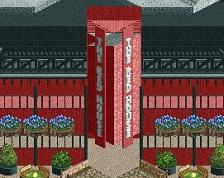
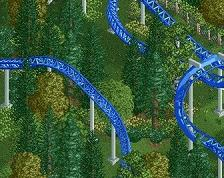
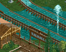
@inthemanual: The height difference was a idea I wanted to try out to make big buidings look more interesting. I did that a couple of times already in "LBATP" and "Valhalla" but I thought doing it exactly the same way a third time would be a little bit lazy. So I came up with this. Having the roof rise up the the two "pillars" in the middle and sink back down in between. Same thing with the arches below. The middle arch being the widest and highest.
@BlazingEmpireHD: You´re right about the path being boring. As for the scale that is fully intended. This is "Fantasy Valley" it´s supposed to be big, if you know what I mean.
@Lagom: I´ll try. Sometime in the next well... time?
@Jappy: That´s funny. Tried to avoid that
Wish I was that productive while intoxicated. Who knows, I might even have a finished park. Glad to see you working on stuff again.
Ich really really love those Buildings. They seem a bit large in scale but i think the big place around it makes it fine