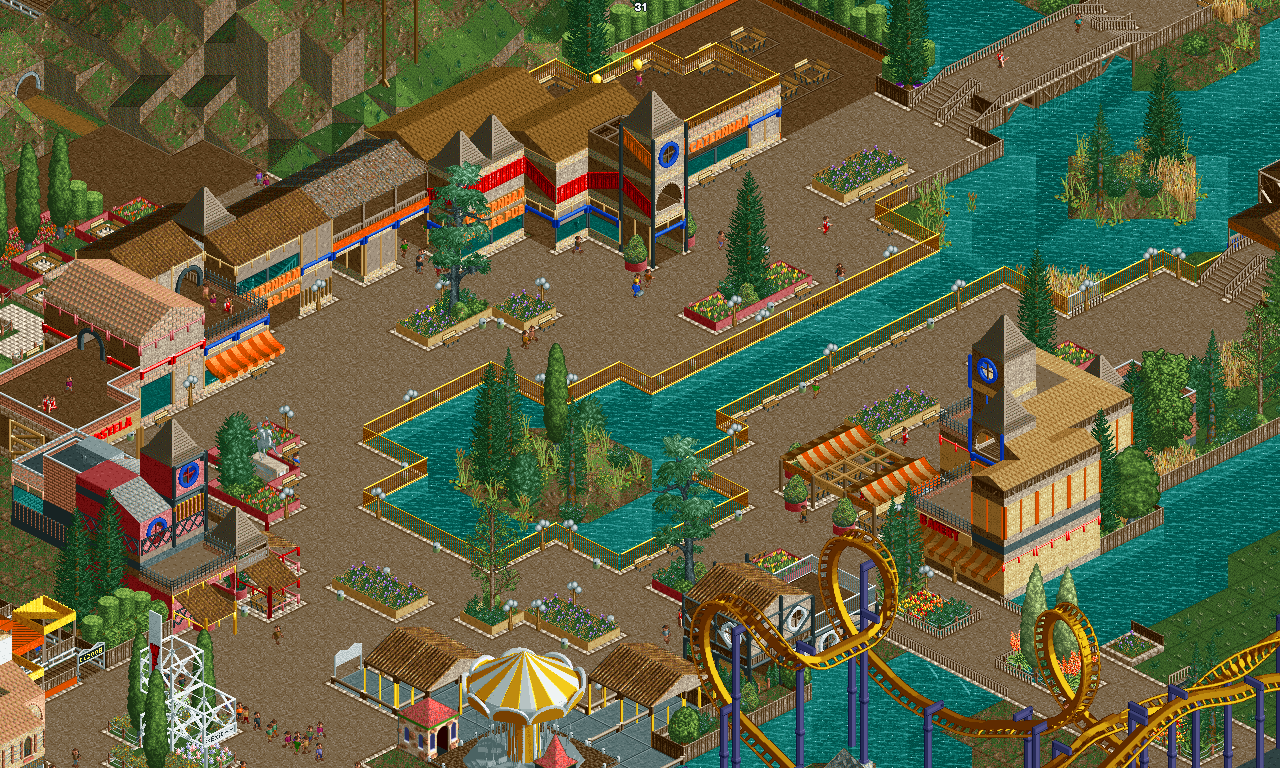
Screenshot / Redlynch Heights - Main Street
-
 16-September 17
- Views 1,257
- Fans 0
- Comments 9
-
 Description
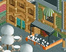
Since its opening in 1995, Caternham Grille & Pub has been the fan favourite eatery in Redlynch Heights. Day after day, its total average attendance throughout one day is 6,000-12,000, with the highest on record being 17,850 when Montanhoso opened up back in 2010.
Caternham Grille & Pub has the highest profit of the eateries in Redlynch Heights garnering over 6,150,000 in one minor year. Pretty good, if ya ask me.
------
Note: Surroundings are still a bit unfinished, so bare in mind at that cost. Enjoy! -
 Full-Size
-
 No fans of this screenshot
-
 Tags
Tags
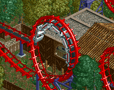
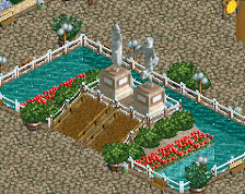
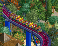
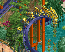
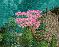
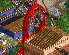
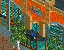
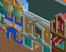
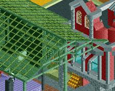
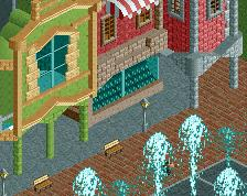
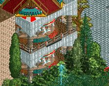
Because one angle is never enough!
I think your first screen reads the best. I like your water channel coming into the courtyard area. Maybe connect the flower planters at the corners... i like where this is going but as you know it's missing some elements to make it pop. maybe the definition between buildings... nice work though
The area seems well laid out, but the buildings themselves seem like they're just brown buildings with colors splashed onto them. Maybe try to focus on some specific theme?
Julow would like to have a word with you
I think I can gather what I need be fix for this main street area - theming. Thanks lads!
There are a lot of browns and tans here, mixed with warm yellows, bright reds and oranges. If you wanted to create a warm muddy atmosphere, you succeeded. I think with some cool colours, this could look at least a little more inviting. Maybe changing the wall colours for the planters could be a good start especially the tan/light brown ones; that doesn't really look good with the brown path right next to it. Even the flowers are more or less yellow/red. I'm guessing all of this was purposeful, but it doesn't make me like it more than, say, Montanhoso.
I do like what's going on in the top left corner there with the Lombardy poplars and the seating. Looks charming. The Bordeau red building next to it with the dark blue is also interesting and works well.
Keep up the good work though, my dude! You're capable of some really nice NCSO.
In addition to ITM's comments, maybe looking at real life buildings for reference would help. Especially when going for more plain building styles.