Screenshot / Plaza Italia
-
 14-September 17
-
 Jardin Botanique
-

 3 of 3
- Views 1,545
- Fans 0
- Comments 4
-
 Description
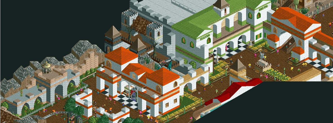
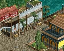
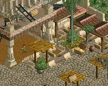
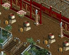
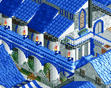
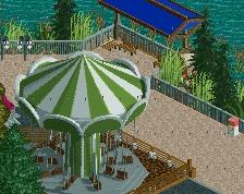
Another screen from this old, never-finished and sadly-crashed park. The idea of the project was to make a Phantasialand-style park with very limited space. It was fun working on as it forced me to be creative with the available space and demolish lots of rides that weren't really that bad, but to replace them with better stuff. This one was supposed to be an Italian-inspired plaza.
-
 Full-Size
-
 No fans of this screenshot
-
 Tags
Tags
Top Spin placement rule #1: Peeps should have a nice way to look at it from right in front of it.
This is pretty solid stuff, except for the awful checkerboard texturing.
Next time just use path blocks or a more simple land texture.
I like this decently enough, though it feels a bit under-detailed and very very....bright.
It is a shame that the park crashed out on you - this was shaping up to being a really nice accolade for you, potentially.
I do hope to see more from you soon, however!
It is a pretty solid design... KUDOS!!
But I'm kinda waiting for some Mario karts to start start haulin ass around the screen or something