Screenshot / Zaccanapoli I
-
 13-September 17
-
 Zaccanapoli
-
 1 of 4
- Views 2,723
- Fans 10
- Comments 17
-
 Description
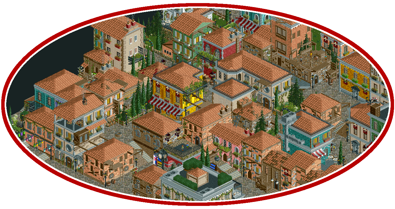
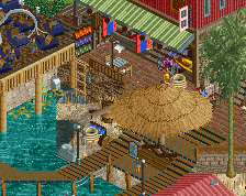
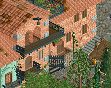
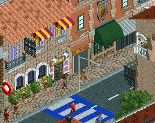
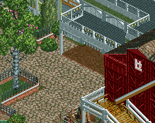
With the unfortunate halt to the Venice recreation, I've been busy building a fictional Italian hill town of my own this last half month. After looking at works like RWE's Port of Parenzo and Cocoa's new semi-fantasy Italian project, I've tried to use whatever little experience the Venice recreation has given me and infusing it with a more modern touch. So instead of being set in the Renaissance, this new non-park is a look at a slightly overlooked modern Italian town. Still learning a lot as I go.
Without further ado, here's an introduction to the town of Zaccanapoli:
[Note: Zaccanopoli actually exists, but this town is not based on the real thing. The name sounds cool to me so I'm sticking to it.]
Zaccanapoli is a short drive from its more famous sister town Saluzzo, overlooking large plains famously seen more around Tuscany.
Recognized by I Borghi più belli d’Italia in 2006, it has maintained a consistent influx of tourists for the last decade, though hardly comparable to any of its neighbouring towns. With unique architecture that can only be described as something between the traditional brickwork of San Gimignano and the pristine colours of Venice, it's the perfect middle ground for those seeking a quaint example of Italian beauty that can be seen in very few towns across the country.
With a humble population of 1000, its roads are consistently paved by inviting two-floor hotels, awning-laden colourful restaurants, small artisan workshops and a flurry of houses between it all.
Zaccanapoli invites you into its doors! -
 Full-Size
-
10 fans
 Fans of this screenshot
-
 Tags
Tags
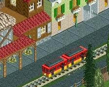
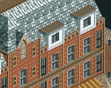
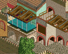
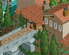
The framing of the screenshot is interesting.
I can see there's a nice bit of color, and the screen itself is pretty good, but man there are a lot of beige roofs!
Wow, this looks lovely. You're rocking the aged/modern clash here.
This is interesting. I'm curious to see the overall product - I agree that there's kind of a single note to the roofs so far and it could use a bit more variety, but I like where it is so far. You already know how I feel about some of the path texture choices.
This looks great. I just wish there was a little more variation in the colors of the roofs
INCREDIBLE
yeah i'd make some of these roofs terracotta maybe, and maybe have one have some tiles missing etc. little details like that go a long way
Very nice. I agree about the rooves. You could also vary the width of buildings, all seem to be 2 tiles wide.
Neat. Love this style. But, like people above this reply said, vary your roofs a little more and it'll be golden in no-time.
I think this is pretty much perfect. Perhaps you can use a bit of the multi color Spanish roof object to vary the textures a little, but its not a huge problem.
Your balance of texture, detail and cleanliness is quite impressive. When most people attempt stuff like this is just a mess, this is fantastic.
You took Parenzo and made it good. lol
^Do not say that.
This is amazing. It has a lovely, chaotic atmosphere. Each building is different (for the most part) and to each its own character. Every building is characterized with creative architecture and smooth colours. This really reminds me of an Italian town, if ever I have seen one.
The only detract I see has been discussed several times already - plethora of the same roof type. Change it up, and this will be in an element of its own.
This is leaps and strides to show that you are really becoming into your own legend. Please do keep it up. I am in absolute love!
You may be the first person I've seen to do a Venice/Italian theme and actually pull off the textural richness of the real thing. This is excellent.
This is pretty fucking cool!!! The aqua walls with the duct work gets a bit lost, But this is great work.
I'm beyond honoured to hear the reception of this, the work is seemingly paying off
To address the issue of the roofs, I can definitely see where you all are coming from. I'm not particularly a fan of doing it all in the tan Spanish roof. Something more reddish-brown (not a colour custom object, perhaps just a slightly more accurate unique olden Italian roof piece) maybe. Then again, I worry that would have caused a problem of information overload. I'm still learning a lot as I go through this, and I'll keep trying what works better with what the world of CSO has to offer. Thank you for noticing that issue, I can focus more on it now. I'll probably have to go with that one Spanish roof object with the different coloured tiles, which are already visible in the screenshot.
I'm also noticing the 2-tile width of almost every building is probably not good, it's an unintentional flaw. Might be too late to rework all these buildings, but I'll especially keep that in mind for the future, Alex. Thanks!
I made that teal building very early on, I guess I should rework it. It's indeed feeling slightly off. Thanks for noticing, SpiffyJack!
I'm still infinitely grateful to you all, this is being received better than I expected. @RWE: Parenzo has a ton of great concepts that I can't yet pull off, no idea what you're talking about lol
So good...