Screenshot / Mundos Magicae... A world of mystery and adventure!
-
 12-September 17
-
Mundos Magicae
-
4 of 7
- Views 2,786
- Fans 3
- Comments 21
-
Description
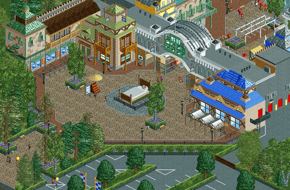
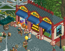
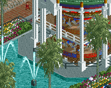
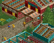
Come and see the miracles and experience of the world of dreams, adventure and mystery at Mundos Magicae!
The traditional entrance shot of my upcoming project. Progress has slowed to a crawl recently but I'm hoping to get some time soon to work on this! -
Full-Size
-
3 fans Fans of this screenshot
-
Tags
Great entrance! My only real complaint would be the bright red maintenance doors. I would make them dull red so that they don't stick out too much. The road lines add more glitches than that they actually add to the area. You can do without them.
yeah the doors are off putting but the rest is gorgeous.
Where the fuck did this come from?! Gorgeous archy
*Jappy's Mundos Magicae
Wow, this is for sure your best screen yet. You improved a lot on architecture!
Fantastic work, well done!
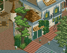
i really like the building with light brown walls and pale green roof. it feels right to me. I think you're almost getting the belle epoque look right, but maybe are just missing it. I think the buildings right now feel a bit disjointed, and I still feel like you're being held back by some older object choices and blocky styles that would be right in an older european-style park but don't quite mesh with a more detailed, architecturaly precise style. does that make sense? idk
This almost doesn't look like Jappy's work!... which is a compliment, but at the same time not an insult. Your previous work has been excellent, but there's something about it that always makes it identifiable to your building style. This breaks the mold into a different execution of construction we haven't seen from you before, and it's beautiful. Awesome job!
I'm also not really a fan of all the grey roof usage, either flat or pirate. Black and brown respectively would work much better I think, adding contract without being distracting.
I do really like this though, feels fresh and grand.
Screen is good overall. Right side is significantly less good than the left. I think if you nixed the blue building altogether and continued that side as the same style you have going on the left then you'll have a more cohesive image here. Keep going!
Dreaming
Amazing.
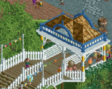
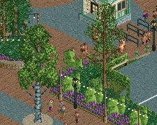
I love the gate structure itself, and those lattice structures within the park are always fun additions.
Holy crap I'm in love with that entrance archway.
You know my opinion, really like it!
Very good entrance, I like the last screens you shared !
That's a hell of a lot of comments! Thanks everyone!
@Sulakke: doors ae fixed, I'm not sure if I'm getting rid of the roadlines, I quite like them.
@G Force: modified the roofs a little, but the grey pirate roofs and the blue roofs are here to stay. I like them way too much.
@Steve: V1's right, reference to dreaming. As I said, I'm not getting rid of it, but I'm planning on adding another building on the right to complete that side.
Dope.
I think having both grey walls and grey roof on the archway building isn't working. Black roof?
I also think the diagonal at the bottom of the plaza extends too far. It's making the space in front of the Blue-roof building awkward.
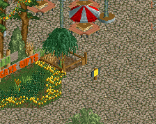
Also for some reason I feel like the bed should have wings haha.
Excellent screen, Jappy! It looks great to be honest. I do agree with Sulakke on the road lines though. Not sure they have to go, but I would change the colour to brown and try to find a way to avoid the glitching.
Also the middle building being almost eniterly grey seems weird to me. It almost looks like it doesn't belong in this otherwise colourful setting.
But still, the screen is freakin great. Well done.