Screenshot / The Alamo - Knoebels
-
 08-September 17
-
 Knoebels Amusement Resort Recreation
-

 6 of 18
- Views 2,558
- Fans 0
- Comments 10
-
 Description
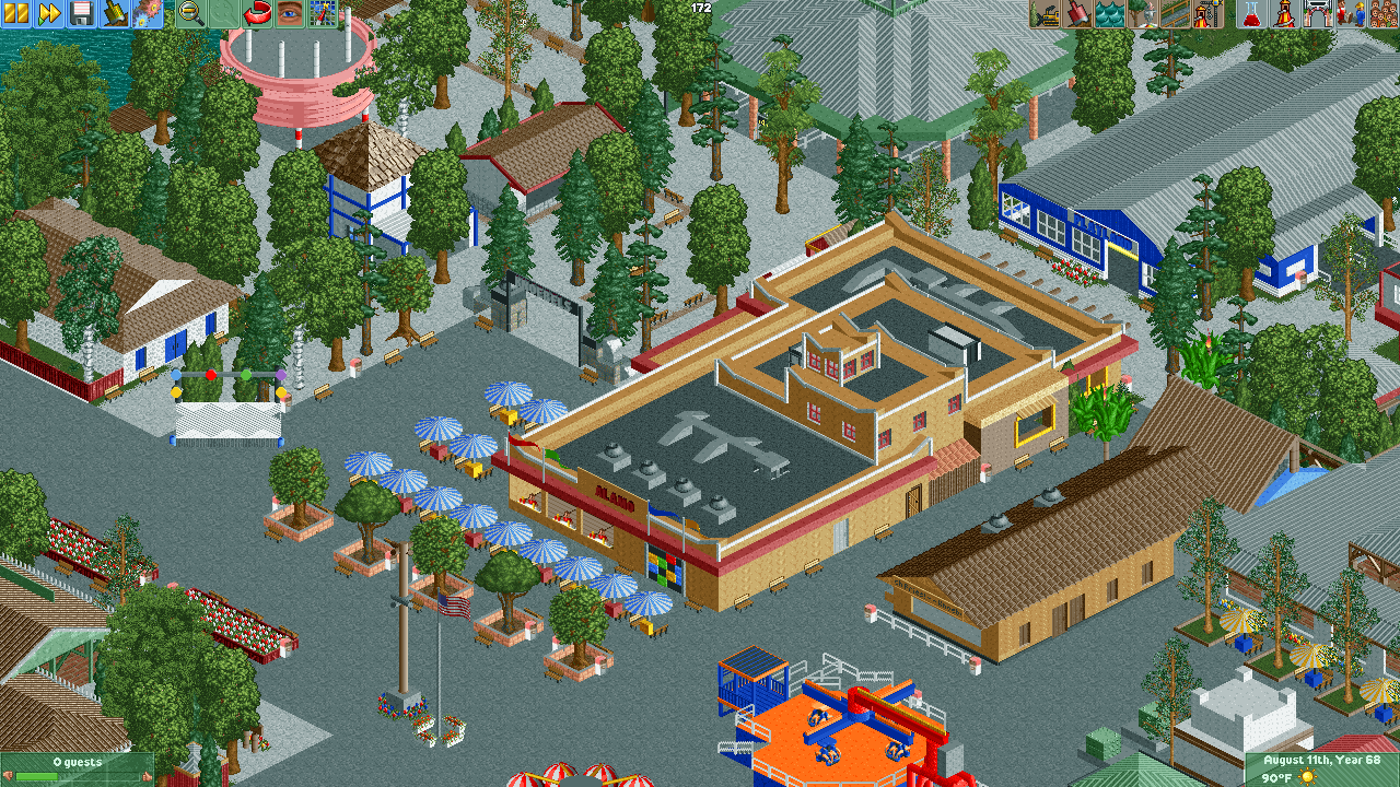
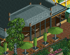
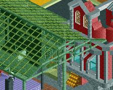
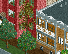
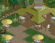
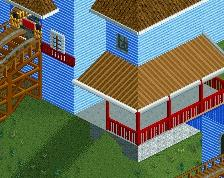
Took a bunch of time to rebuild the Alamo and many other buildings around it. Also lightened up the trees, and found a light grey gravel path that I think works much better than my previous choices and actually looks like the gravel in the real park. Thanks to Jappy for providing some guidance on the paths!
Also got rid of the custom ride I had for Power Surge and remade it with track pieces and scenery. -
 Full-Size
-
 No fans of this screenshot
-
 Tags
Tags
Wow, definitely a big improvement here!
Glad you're taking the time to re-work stuff. Makes people much more willing to comment if you show you're actually going to listen and attempt to improve.
However... I think i'd prefer a bit darker path texture. The white might be a bit too bright. But that might just be me.
The archy looks much improved though. Seems you're getting a much better handle on the cso available in game.
Oh yes. Big improvement. I am loving the colours. Minus that custom flat's orange bottom, to which, I find too bright.
Speaking of that custom flat, I love it. It is brilliant. Archy is far better in a few aspects than before. You are surely improving!
I agree with G-Force, though. That lighter path is too bright. Keep this up, and you will bring many back for more!
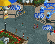
THIS times a million. I'm not sure I like it either, but I looked all over the web for a slightly darker shade of grey for the gravel. I found one that was almost the same color as the tarmac (see image), and it was okay, I just didn't think it provided enough contrast. The texture is definitely gravelly though. I can certainly switch it over if you think it might look better.
Attached Thumbnails
Yea, I think the 3rd from the left is the best choice, the one that is slightly lighter than the default. At least that's what I would chose, its really up to you.
@G Force
Third from the left is the default. I was thinking the second from the left for the gravel, slightly darker than the default, but still gravelly. Maybe I'll try making my own path at some point and see how that works out.
For some reason I confused it with the lighter K0NG custom path tile texture. Which is another thing you can use... Check out Grona Lund or Starpointe and you can see that the use invisible path on top of path block scenery objects. This can keep the buildings from glitching on top of the path and give you some more flexibility.
Anyways, looking at those 3 options, I would use the two middle ones primarily. The super light and super dark ones are just that, too light or too dark.
Consider some of these options:
https://www.nedesign...11483/kngsndpa/
https://www.nedesign.../11535/gwpthmp/
https://www.nedesign...11423/kngowpth/
https://www.nedesign.../9802/sffpbm16/
@Coasterbill, what do you think of the light grey pathing for the gravel in the park? I know you have a lot of Knoebels knowledge.
so much better. well done. fantastic improvement.