Screenshot / Untitled Park Entrance
-
 08-September 17
- Views 5,315
- Fans 0
- Comments 17
-
 Description
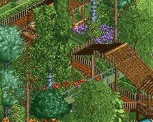
Haven't named the park yet, but I'm really liking how the entrance is looking, (considering I've never made one before) and I'm hoping its not to dense for your taste. The right side looks a bit too dense from this side, but it looks barren from the other side if I don't make it dense on this side =/. I'm trying completely different architecture that looks much more life like and rustic (inspired by the Westwood).
And I apologize, but I must give credit to Julow for the design of the main arch. It was scrapped from the Mammoth project for some reason, and when I saw it...well I just had to have it here. XD The rest was me though, promise.
Now can I get my usual harsh criticism and and a 50% please. =P
edit: Woo got a 60%! #progress XD -
 Full-Size
-
 No fans of this screenshot
-
 Tags
Tags
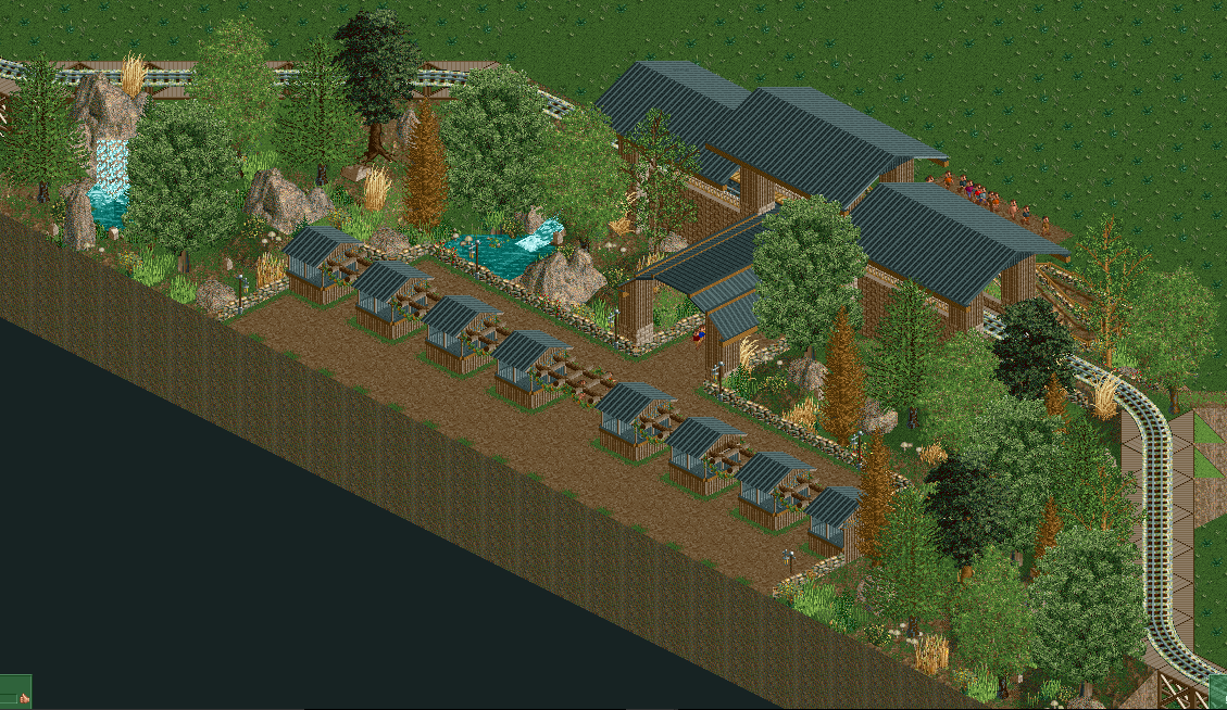
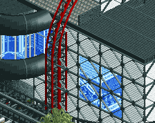
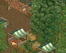
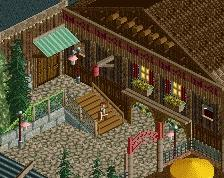
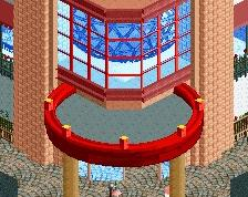
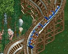
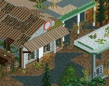
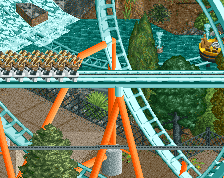
Shot from another angle and a building that will likely be placed behind it somewhere. Maybe I should add a waterfall to the other side?
Attached Thumbnails
It's nice. I like the colours. I appreciate the serious look you're going for. I would experiment more with the foliage. You've found this one combination and you seem to do it always. At your early stage of development as a player, I would experiment a lot, even with things you wouldn't expect of yourself, and see how your taste reacts to it. It's a routine that established over time and you need to build it now. Looking forward to seeing updates from your process.
Thanks for the compliment and advice, Posix. I'll have to look into what I can use in the forest. I use to have more types of trees/colors, but I got called out for it in my original designs as having too many trees and too many different types of them so I've backed off quite a bit (2 different trees got axed out completely). I do see your point though as it is a bit repetitive, and I'll have to try some more testing. On a side note, I'm beginning to have a lot of fun experimenting with rock and water as of late.
It has an interesting modern feel to it; but some details and more pops of color could do it wonders.
That archway was in Mammoth? I don't remember seeing that anywhere.
Thanks for the comment, I'll have to test with color, but I don't want to change the look too much.
As for the main archway, it was "scrapped" from Mammoth, as in its in the screenshot of Mammoth, but its not in Julow's final product.
Thanks for the comment. Color seems to be the main complaint...I had originally thought of making the roof pale green, like on the Grand Californian to give more color, but the look left me feeling luke warm, so I stuck with black. I will continue to practice, and I'm planing on adding wood walls to my selection of building materials.
Attached Thumbnails
I still think you could add way more colour to this. What it looks to me is you have only changed the colours of the rooves. Detailing with colours thrown into the mix would help tremendously.
Like others have stated, I would prefer to see more detailing amongst the train station, and the little entry buildings.
Other than some rather small issues, I quite like what is going on here.
Oh, I like those colors there.
The train station needs some change. If I were you, I would ditch the default station and hide it with corrupt elements, and use scenery objects to make a custom platform.
The rooves could use a bit of work. Even something as simple as adding pole objects as exposed framing would make it look loads better.
Also, I recommend you either use those sttone walls as either fences or building foundation, but not both. It looks a bit odd seeing that texture used in two places like that.
And this is why I'm banging my head against a wall trying to figure out what course of action to take. You and Posix say yes, while others say no.
-Instructions not clear: **** stuck in vending machine.
2. Sometimes you just gotta listen to your heart. Conflicting criticism will always happen, try doing what you think works best and come back with a new screen.
I like the new update, and agree with CC9 and Stoksy.
Hmm,the problem with adjusting the station to be honest, is that the roof is already so low from its largeness, you can hardly see what is in it, thus its very hard to work inside, and working it may be for little gain. What would would I replace it with? Wood boards? Here is an example of if I swapped the station pieces of the track for wood board. You can only see the very edge of the board. I have not added the wood window yet on the back of the real version, and I'm not sure whether it could be placed on the front either due to the arch on the front side. I will see if i can add rigging, but the issue has been that for the most part, even if I put diagonal beams to the roof, you cant see them, unlike on the small house.
Also, can you elaborate on the stone? You mean the mix of Lotr fence and stone blocks?
Attached Thumbnails
I really like the colours in the original screen, as well as the one with the dark green roofs. Both work really well, in my opinion. Keep building, I really love this!
As for the wooden boards, I meant that they should go next to the track, not on it. And it doesn't have to be the NCSO wood boards, or even wood for that matter. I was using wood boards as an example.
Alright, thanks for the clarification on the stone and the station. I'll see what I can come up with regarding the wood boards. At the time, it didn't make sense, but now that I think about it, I have an idea for what I could do using 1/4 wood tiles and fence. Also, in regards to the rigging, I have an idea for what type I could do, based on what others have done, but I still have yet to find/search for the right scenery for it.