Screenshot / More Trees - Knoebels
-
 05-September 17
-
 Knoebels Amusement Resort Recreation
-

 5 of 18
- Views 1,860
- Fans 0
- Comments 11
-
 Description
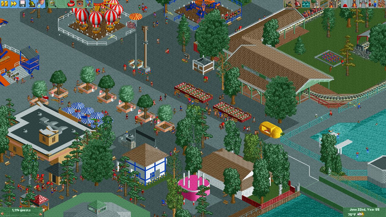
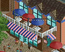
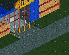
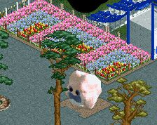
Similar to previous screenshot, but added more trees, added a number of planters with flowers and more trees to try to break up the paths a bit. Also made some changes to the train station building (made a bit smaller, reduced roof overhangs, and changed roof color). Also added a number of small details (Pioneer Train sign, lemonade stand, ticket booth, flags on the Alamo restaurant, and on and on...)
-
 Full-Size
-
 No fans of this screenshot
-
 Tags
Tags
Definitely another improvement.
Perhaps still a bit too much grey path, perhaps consider leaving some green space under the trees in the path? Maybe use the 1/4 diagonal path textures to pull this off.
But again, I still think the color on your trees are a bit off. I much prefer the "moss green" rather than the "dark green" which you're currently using for the majority of them, however this could just be personal preference. It would probably help give it a bit warmer of a feel though, right now its almost a sickly feeling.
- The paths look hideous and obliterate any chance of having a nice atmosphere. Do you have a reference picture of what you're trying to replicate?
- The trees have weird colours
- You're rushing the park, leaving out a whole layer of rather crucial details like a trim around the pool, or previously planters for the trees - they were planted on top of the tarmac. Take some more time to get details right and your park will make a giant leap forward
Regarding the paths, here's Google Street View of the same area in the park...
https://www.google.c...!7i13312!8i6656
In this area of the park (and most areas of the park), there is pavement and gravel (they're both about the same color irl). The trees tend to not have any planters at all, and grow right through the gravel. In game, I was using the light grey pathing for pavement, and the dark grey for gravel. I'd appreciate any help on this you can give. I know the paths make this park look terrible, but I'm trying to stay realistic as well. They don't feel terrible when you're actually at the park, so not sure how to help have that feeling in game too.
The tree color I will be fixing the next time I work on the park.
The pool area is completely a work in progress at this point. There's a bunch of stuff still to be done (buildings, water slides, etc.) that I have somewhat started and haven't finished. I should try to cut these areas out for future screens, shouldn't I?
Tree colors will definitely be changed. I like the idea of using a lighter green for the majority of the trees, so I'll try it out and see if it makes the park feel a bit warmer. I'm a bit hesitant to add green beneath them, just because I feel as though I'll lose that Knoebels feel of the trees growing up through gravel.
I've been taking a look at this and Knoebels via Google maps. I might have a few tips.
Your rides seems waaay too spaced out. I suggest putting them closer together to create the woodland feel of the park.
In terms of path, I suggest using the K0NG off white park as demonstrated in my screen. It seems to represent in my view the best the texture and colour of the path in Knoebels. The tarmac is too....tarmacy and dark. On the left you can see the three main colours of tarmac. From left to right, coloured black, default and white. If you do insist on using tarmac, I'd say colour it white, the lightest colour. For the trees, you can put colourable flat roof pieces under them. They aren't planters, but suggest a patch of dirt through which the tree has grown.
Good to hear you're gonna tackle the colours of the trees!
The Alamo is way too small, and luckily if you make it larger and add some details it will help you with the path problem too.
The side of the building has a ramp, an overhang, a flower box out front, a mural and tons of details that would really help you make this look better and cut down on the path at the same time. Make the building larger, extend it to the top left if you need to. It seems like the path between Alamo and the amazing Pierogi place is too big anyway.
Definitely gonna try this path next chance I get (after I fix the trees). Thanks for the tip!
I completely agree with the Alamo being too small. That was something I noticed back a few weeks ago when I extended the park in that direction (things weren't lining up right and I realized its because I forgot the whole back of the building. If I recall there are large windows and whatnot where there's an indoor sit-down type restaurant. Extending to the left and down should make it a lot better.
I see you raised the station roof; looks much better. I echo what Jappy said about path choices; the dark tones look too much like asphalt. Definitely listen to Coasterbill; he's very knowledgeable when it comes to Knoebels.
The concept is there; there are just some fundamentals missing that have mostly been commented on at this point. Very interested to see some coaster layouts!
I do have Impulse up and running.... but it still needs some work. Hopefully I'll be happy with it and some point soon.
What, more tips on scenery? Well, when the opportuinty presents itself and I see something that could be much better by just using a different sort of object, then yes, more of this