Screenshot / Small Eating area
-
 04-September 17
- Views 1,513
- Fans 0
- Comments 17
-
 Description
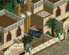
Some of you where curious what the actual land looks like next to The Arizona. So here is my small eating area/shops and the entrance to a dogems under ground. I admit, that the two buildings are pretty much Julow's buildings which frustrates me because I've never been great with buildings, but I'm trying to improve and scale is very important to me (I like compact buildings). Any advice on buildings would be helpful since you guys seem to really think outside the box on here. I did kinda screw myself with my map object selection, though...so no chimneys because no stone. ;_; Also, you cannot see it, but there are actual working stands inside the buildings and a single covered wall is missing on each to let guests in.
(The whole area is kinda structured like critter country at Disneyland to be honest)
Anyway, this will probably be my last picture for a bit until I'm further along. Hopefully the next update I'll be able to show the full image of The Arizona and have a bigger picture rather than these snippets. Thanks again for the comments and critique; it is the only way to improve, so I do appreciate it, even though it can hurt at times...now let the heavy criticism begin. XD -
 Full-Size
-
 No fans of this screenshot
-
 Tags
Tags
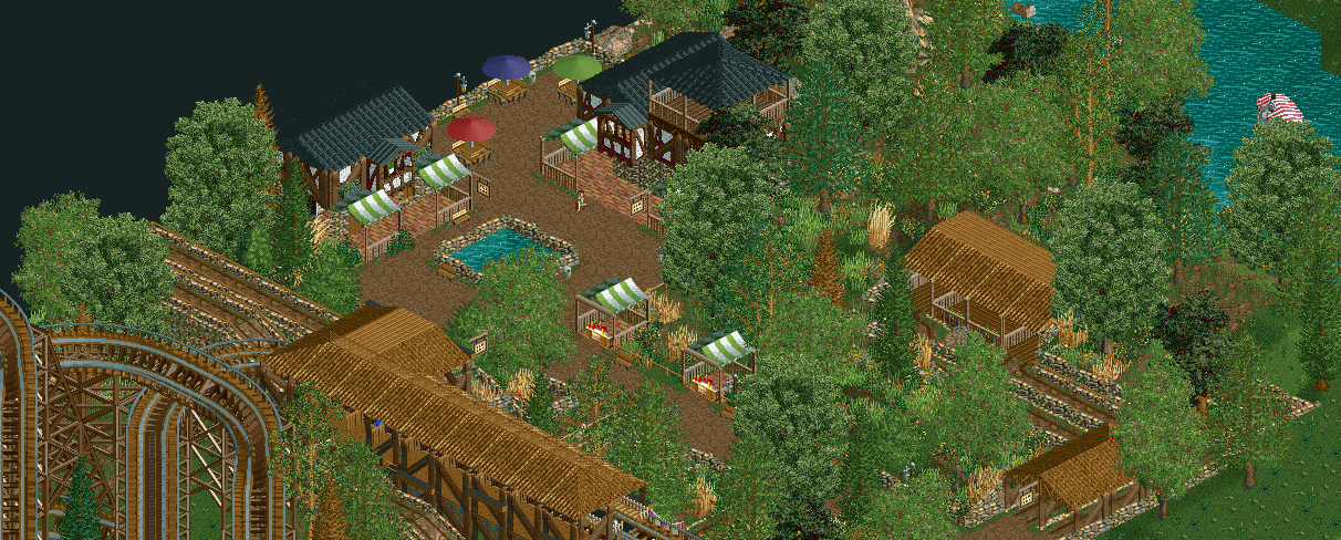
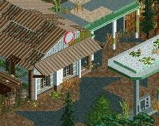


I think its all pretty good, but the roofing in general could use some improvements and more complexity. Especially the black roofs - i think the sides should be white like the rest of the buildings.
Looks a little bit too much like Julow's recently released Mammoth.
@Sulakke & @Fass, I can agree with that and figured that would happen unfortunately. While I cant really change the textures at this point (as I plan on expanding this into a full size park), I plan on reworking the buildings so that they aren't exact replicas of Julow's as they are know, and I've started experimenting with buildings. Hopefully by next update, I'll have something better/my own style..
1 down and one to go. Actually turned out better than I expected, and I actually think I may like it more than the old one.
Attached Thumbnails
Better, it could use a bit more color though.
Early on it might help looking at reference photos to a real life building or concept art, just to give you a bit more to go off of. Creating a building from scratch in RCT is quite a difficult task if you haven't been doing it for years already.
Generally, I don't think its a problem if you try and replicate another players style early on. As long as you work to create your own as your skills develop and refine themselves.
'G Force', on 06 Sept 2017 - 03:18 AM, said:
Thanks for the tip/compliment G Force! Yes, constructing buildings is something new to me and it takes hours, but I think I'm picking up on things/making things up quickly. I would like to add more color, but I don't want it to feel forced and I'm still trying to keep the rustic look which kind limits my pallet, I think. I've added a few silver "repair" roof tiles since and I think i may shorten the roof section above the windows but I'm not sure how else to expand the pallet without it looking odd/checker boarded. I want rustic, but I don't want the disrepair/dilapidated look either. I'll think about it and see what I can do.
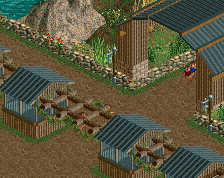
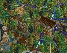
And here the is the second building, yet to be reconstructed in the proper position:
Attached Thumbnails
I think that roof texture is really ugly here. It does not mix with the other textures you are using. The composition of the building is pretty good. The middle pole is useless though, as it is not supporting anything.
Sulakke, on 06 Sept 2017 - 09:47 AM, said:
Thanks for the compliment/critique. I can agree with that, Sulakke, to some point, but unfortunately its kinda my only choice. Corrugated roof is the roof tile that I have the most diversity with due to my texture choices. I only have full square panels for other styles wheres as I have the 1/4 tiles with only corrugated and awnings. =( I might try changing the color to a different shade of brown or maybe black, but I'm kinda limited in options to be honest. I'll see what I can do with the middle pole.
Removed*
Are you familiar with ParkDat or OpenRCT? Both could allow you to pick a different roof type without starting over completely.
As far as content; I think it works as a dingy mining shack or something of the sort, but I don't know if that's what you're going for. There is a *lot* of brown involved thus far.
CoasterCreator9, on 06 Sept 2017 - 4:27 PM, said:
I am using OpenRCT currently, so what I will probably do is load the map into the scenario editor and convert the map to a scenario and re-tweak the objects to be exactly what I want (remove certain trees and parts I never use and never want to, etc). I will need to rebuild The Arizona coaster but I've already had to do that twice, so its not really a big deal- more just a hassle, and I'll have to put the dodgems back in the hill.
I agree with you that they do look a bit too much like mining buildings really. But hey, i wanna build a mine train some where else, so i guess I'll just recycle them until then.=P
I need to add the stone/1/4 tiles and more wood beams to my set up among other things, then I think I will be able to achieve the "rustic" look. I now think I'm missing what I really want at the moment. I want the "Grand Californian" rustic, and this ain't it.
OpenRCT let's you edit the object selection from in game.
inthemanual, on 06 Sept 2017 - 7:10 PM, said:
You can?
...
Ah ha! And so you can! I didn't have that tool option active before and just found it. Thank you, that should make life easier.
It's good. You're talented. Overfocus on trees for now, and path coming down to single-wide out of quandary is a no no.
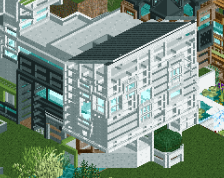
It's nice how you're so fresh. Every other building you make looks totally different. In the future, you should experiment a lot on a separate blank map with styles of architecture and landscaping design, and then distill what you like into the overall language of your project, combined with some basic macro planning (=what goes where, composition, main path flow).
posix, on 06 Sept 2017 - 11:49 PM, said:
I...I got a compliment from Posix...I'm...I'm not gonna cry. XD Thanks for the compliment and advice, I appreciate it, and I will see what I can do. I've just started a map for architecture per your advise, and I'll see about designing a new building that doesn't have the same problem as this one in regards to the pathway. As for the trees, I've been trying to wean off placing too many and allowing the player to see the ground while still trying to keep it good from all 4 angles, but I'll keep you guys updated on my forestry periodically in case I start coming unglued again.
On a side not, you guys have all been a great help in developing my skills, and I hope that I don't disappoint too much as I go forward!
Removed*