Screenshot / Havana Cadillacs
-
 31-August 17
-
 TerraVentura
-

 8 of 15
- Views 8,080
- Fans 6
- Comments 14
-
 Description
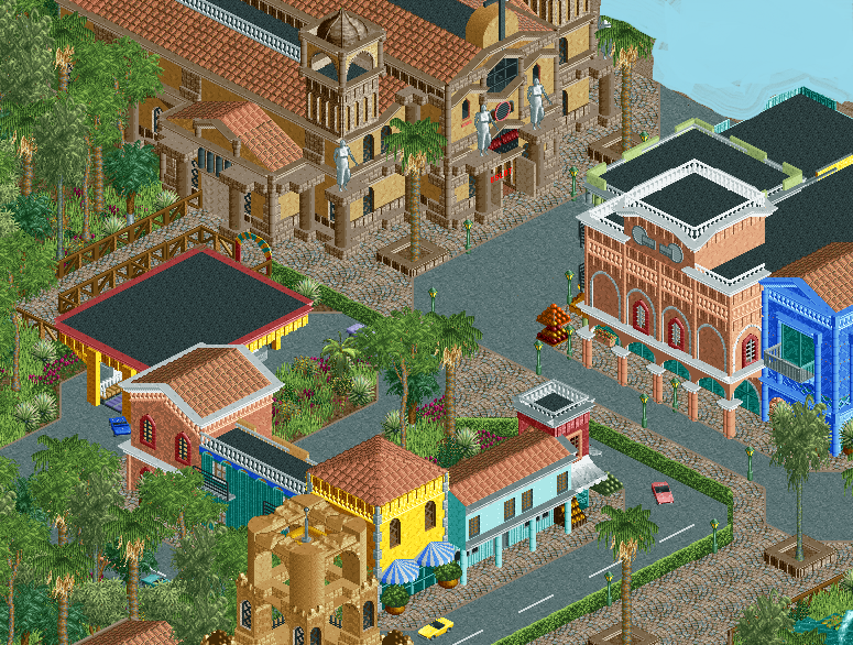
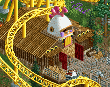
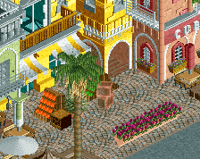
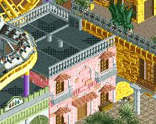
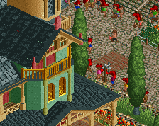
Make a tour trough the Cuban capital Havana with a classic Cadillac car! Experience the great and colorful architecture Havana has to offer.
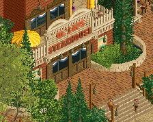
If you dare, enter La Iglesia del Miedo! But you've been warned... angry demons are hiding in the church... -
 Full-Size
-
6 fans
 Fans of this screenshot
-
 Tags
Tags


![screen_3610_El Diablo & Casa Magica [WIP]](https://www.nedesigns.com/uploads/screens/3610/3610_thumb.png)
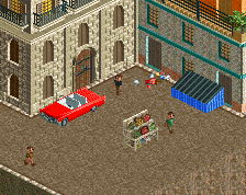
You've captured the feel of the area perfectly. I love that chutch and the Hispanic influences are clearly visible. I don't understand that hedge near the road though...
I do miss the iconic cars though. This might be one of those rare moments the WW American car object could be used. I'm sure there's a modified non-WW colourable version of it out there.
The hedge is there for separating the car ride from the actual path
Now that's clearly amazing. The building with the statues is amazing. The foliage is amazing. The paths and the roads are amazing (I don't have a problem with the hedge near the road personally). I love the brown fences you added on top left of the picture, it fits very well with the rest of the area. Compared to your previous screens of this project, I think the contrast now is on point.
The little negative points for me are:
- The blue building is a bit too blue, and misses some details.
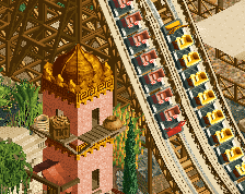
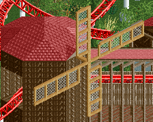
- The brown tower with the free fall, it's hiding the area a bit and it's adding a little mess to this screenshot, but nothing alarming since you build in 4 angles like everybody else.
To sum up, this screen is great and it's clearly 80-90% for me. I'm finding again the Fred who built Arevik. I hope you will follow what you did here with the details, foliage and path for the rest of the park.
This is GREAT! The upper most bldg has one of the best design/looks that ive seen in a long time! the window over the entrance is an eye catcher for me. The rest of the layout is done very well and the choice of using the hedge at the road is quite common as to have foliage separating spanish villas. I think a 1/2 tile planter under the hedge would put it really spot on. EXCELLENT WORK.
I cannot wait for more!
Haters will say MS paint was used
Looks nice, would be perfect if it would look a little bit dirtier, if you know what i mean.
Awesome! Very Cuban.
I don't mind the hedges separating the car ride from the road, but the main path ends up too tight because of that.
I don't mind the hedge, but I wonder if it would block off the view of the car ride from the path?
perhaps drop the hedge a unit and put another fence on top so the peeps can see over the hedge and through the fence?
Your best work, Fred. Very, very good! Please remove the station platform though. Keep it up, man!