Screenshot / Redlynch Heights - Montanhoso + station - New for 2017
-
 05-August 17
- Views 2,186
- Fans 0
- Comments 13
-
 Description
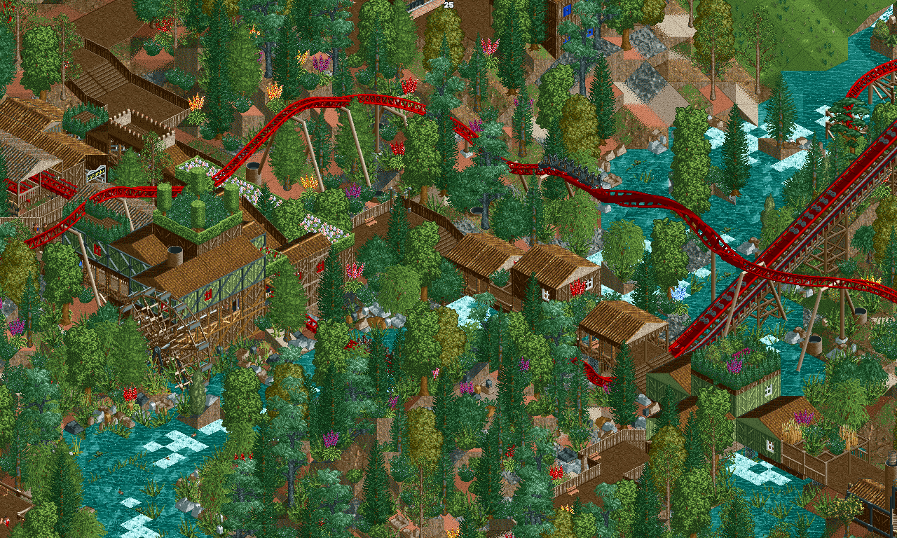
After a long while, and 156 saves, negate the auto-saves, this screen marks about five months of work on this single project. The fun part is that this is like 45% done. What you see here is an Intamin Blitz; the newest addition to Redlynch Heights.
Storyline: Right after the opening of Falke (Dive coaster yet to be seen), people complained that there simply was not enough thrill in the area where Falke now entrances delightfully. For four years, Falke remained the only (big) coaster in its respected area. However, the discovery of blueprints by a trespassing tourist unveiled the plans for a big roller coaster to flourish within the likes near Falke.
A coaster with a few inversions, rapid shifts in speed and height, as well as swiftly zooming o'er the rapids left and right and through a delicately crafted hill.
This idiot...er respected member OF OUR STAFF...(mutters...God be with him...ugh) released the blueprints and now everyone knows. GREAT.
THANKS JOHN. THANKS.
Anyways, here's Montanhoso, an Intamin Blitz; which, as stated before, is the newest huge thrill to erect in the land! -
 Full-Size
-
 No fans of this screenshot
-
 Tags
Tags
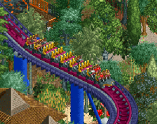
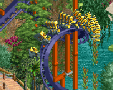
The landscaping is awful in every way, but the rest is pretty good, even the underwater landscaping. Fix the landscaping, maybe look at some Pac or G Force parks and it should help a lot.
Blaze Blaze Blaze... what to do with you...Since we are not complete strangers I'll throw down some feedback. I'm not only going to agree with Kumba, but add a little salt to the wound as well because your better than this. You have grass and flowers where they would never be, at least unless they were in larger patches and not just one here, one there, one on the trellis, one on the roof etc.. and the trees seem to have been planted by Jose Cuarvo on Cinco de Mayo.. the rocks in the water would work much better if they weren't mostly placed in the same direction. I personally would never have squares of rapids! You need to fill the 'calm' squares with brush or rocks to hide the checker board effect. I have some of the best rapids ever produced by anybody over at the Open forum check em out. The mixture of terrain paint also off point. The layout of travel seems to work and most of the bldg textures work except for the castle parapet walls at the roof upper left. I like the farris water wheel too. Obviously the footings are not quite finished as well. With all that being said, It looks like you thought and planned out the track and structures, followed by just throwing out everything else to fill the empty space. You knew this screen would bite you in the ass.
I think it's fine that you're being wild and experimental. It'll give you self-feedback if you're sensible and in touch enough with your taste. You should never look at other people's work and just imitate.
what the fuck
Adding to what Kumba said, the foliage also makes the park hella cluttered. Give your stuff some space to breathe, so we can appreciate the coaster and buildings more.
I'm actually a pretty big fan of where this is going. We don't see enough woodsy coasters on the site. Even though the ground foliage does need quite a bit of work, this is going in the right direction.
Hasn't this same screen been posted on here before? Back in May?
To answer every critique:
Kumba: I've guessed this now. I like the landscape, but I do feel that it is not particularly 'realistic.'
SpiffyJack: Gimme the rapids please. I personally hate square-ish rapids, but this was the best I could find.
GammaZero: I've taken this into consideration; I plan to take this cc given by all about the landscaping and have a more 'not chaotic' feel to it.
No, I will not post another screen three seconds after this is posted, however, on Discord there will come a time for a comparison. Stay tuned.
Sneakyfrankie94: This is exactly how it was pictured to be in my mind. However, the try to encapsulate this image into the game did not fair that well, as I had in mind, of course.
Liampie: I've also considered doing this with this 'second save' I'm going to test out on. Would it be better to have less foliage (some, more sparse than other areas) and have a quantity of rocks in their place?
Iron Rattler: Yep. Only difference is more rockwork and 'cleaning-up' of the whole screen in general.
Continue to provide CC, and I will get better. Thanks everyone!
That's amazing, the only advice I can say would be to improve the landscaping.
I love this, the foliage is objectively terrible but for some reason I like it anyway. This is colorful, bright and bursting with atmosphere and I think it's great.
Not that anyone cares about ratings of screenshots but I voted 75% on this screen. I'm in the minority but fuck it.
This is very good. I like the setting for the coaster. It's brilliant. The lifthill next to the river is sweet. Just wish the catwalk was one unit higher. Good job. Keep us updated.
Like I said before, I won't keep posting needless screens that flood the site. However, that does not mean I won't update my screens.
I'm in the process of redoing the landscaping and foliage to be less crazy and more natural. I've done quite a little bit on Montanhoso, but not the entire ride is done. I've still got at least three-quarters of the ride to go. Excluding Falke (the dive yet to be featured) and Kumanjaro (a suspended swinging, also yet to be featured).
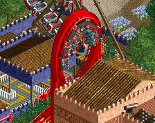
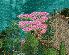
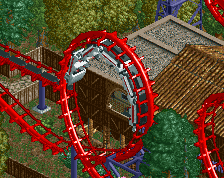
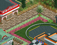
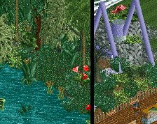
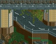
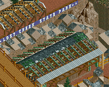
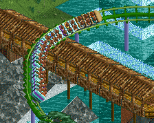
So, that means, be mindful that the outer edges are unfinished. But, here's a few screens of what I've updated:
Rapids, and various other details have been improved.
As well as the real buzz-kill of the screen, the landscaping and foliage.
Personally, I liked the other screen a bit better, but this is feeling and looking quite great.
As well, all CC are taken into consideration for my future builds/updates! Thanks all!