Coaster colors don't work at all here for me, they feel so out of place. Not sure if the simplistic catwalk works either next to the very detailed Archy and theming. Almost makes the ride itself feel like an afterthought.
The catwalk is perfect. Anything too much more would draw too much attention to it, and without it, the ride wouldn't tie in as well.
The Catwalk as is draws too much attention by being so simplistic compared to the rest of the screenshot. Almost like he forgot to finish it or just got lazy and left it like that.
The Catwalk as is draws too much attention by being so simplistic compared to the rest of the screenshot. Almost like he forgot to finish it or just got lazy and left it like that.
I love the overall feel, but I can't help but think the coaster colours are hurting the atmosphere. A purple/lilac/lavender kinda colour could work much better.
I like the coaster colors... maybe due to being colorblind, lol. Only thing I don't like is being able to see the default station and huts. Outstanding overall work!
Top notch! You worked in some interesting textures that really work well in this screen. I'm on board with a change to the coaster colors though, you'll do something great with it I'm sure.
But the Archy is wonderful.
I also agree about the catwalk. Either go all out with it or don't have it at all, hahah. Perhaps this is one of the rough edges.
I still love that gazebo-styled piece of architecture. And the atmosphere is great here.
Beautiful screen.
I don't agree, I think the colors are fine, maybe just change the supports color but it looks okay for me. I also don't mind the catwalk.
I would maybe bring a bit more color variety with the flowers but it's class how it is right now.
And maybe try breaking the straightness of that line of flowers ?
the upper right columns and arched bridge reminds me of a Roman aqueduct.. pretty cool.
I'd change the track color as lavender(pale purple, light purple or whatever.) if I were you. It may blends well and adds some elegant.
I like the catwalk as it is. Coasters colours are the only issue here for me. Rest is perf.
Dude... The placement of the loop, the fruit drop/statue columns, the architecture, and the overall atmosphere... Absolutely stunning.
Shape that lift hill up and remove the exit hut and this will be perfect.
wowowow. Amazing and you're not even showing the best part of the ride.
I like the colours on the coaster, maybe just make the rails dark/deep red?
Neato.
Amazing archy, great composition of the coaster there. Don't like the color of the flowers however, think yellow/purple would fit better.
I love the overall feel, but I can't help but think the coaster colours are hurting the atmosphere. A purple/lilac/lavender kinda colour could work much better.
Not sold on the coaster colours, I would change the gold rails to red and then it would look much better.
I think you need to hide the exit hut too.
I like the coaster colors... maybe due to being colorblind, lol. Only thing I don't like is being able to see the default station and huts. Outstanding overall work!
Top notch! You worked in some interesting textures that really work well in this screen. I'm on board with a change to the coaster colors though, you'll do something great with it I'm sure.
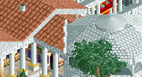
From the entire screen, I find this most interesting.... (pic)
Did you use a corner stone assembly to hide the valley of the roof or is supposed to be a vertical element?