Screenshot / Magic Kingdom Entrance
-
 05-July 17
-
 Project MK
-
 1 of 5
- Views 3,574
- Fans 1
- Comments 14
-
 Description
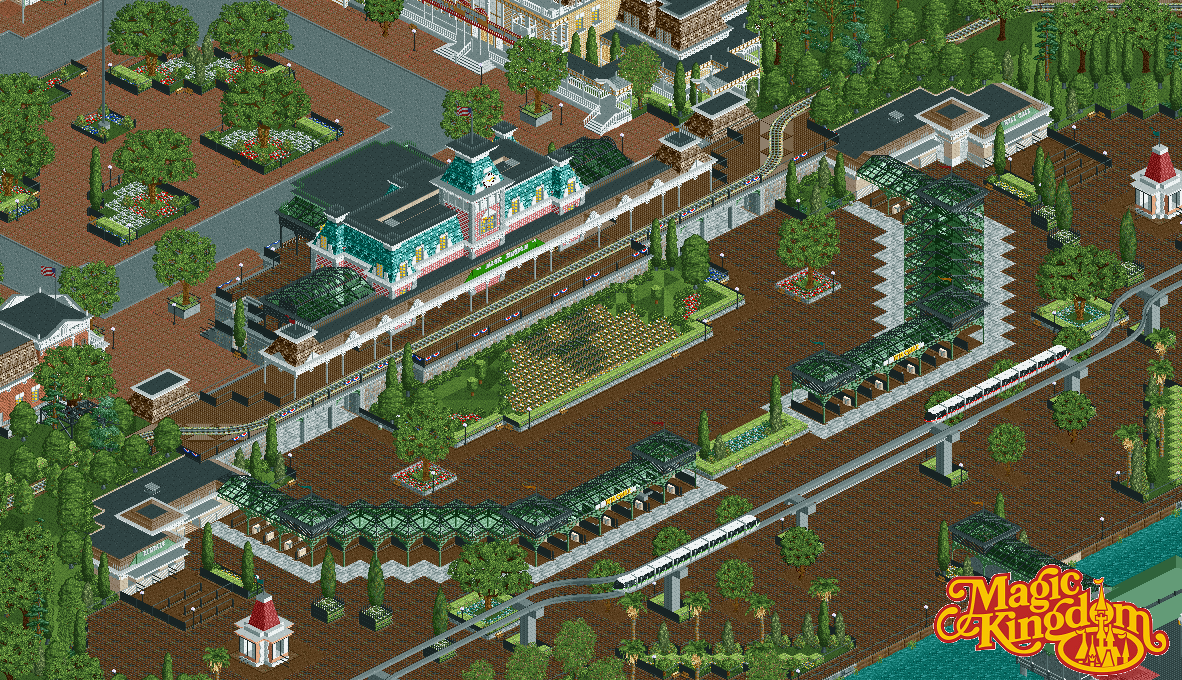
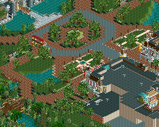
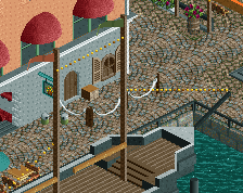
The entrance area to the Magic Kingdom. Various aspects are inspired by the Magic Kingdom (WDW), Disneyland and Disneyland Paris.
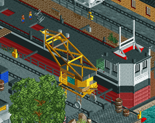
The area includes the entrance turnstiles, ferry boat dock, monorail station (resort and express lines), Will Call and locker rentals.
Town Square can be seen behind Main Street Station. -
 Full-Size
-
1 fan
 Fans of this screenshot
-
 Tags
Tags
And people say I use a lot of path
I think you captured the atmosphere pretty well, so good job.
good to see you still around!
Shouldn't the path be more reddish?
Or is that just DL?
holy shit its highball
The scale might be a little too large overall, which could be why you always have space problems. But I do like it.
I think the path is a bit too dark, but it will probably look much better in game and not zoomed out like this.
This is excellent. I can see why you went for the dark path. I suppose it's the most accurate to the real life counterpart. I don't mind it, however.
Structures and overall layout of the area is spot on, and well done. Very true to the Magic Kingdom.
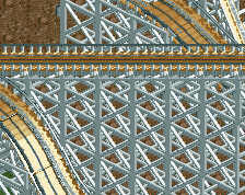
Only suggestion would be to spruce up the monorail supports. I think despite how they look in reality I think some creative liberties could be taken there.
Keep going!
The dark path looks better up close. I could have gone with a different path, but the only other one that works is the red-shaded path. Main Street, U.S.A. has a red path, and I wanted the two areas to feel seperate, so brown it is.
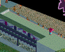
The pink structures are from the Disneyland Esplanade. Just some cool structures I wanted to fit into the park somehow. Now they are information booths.
It's actually Disneyland, Magic Kingdom and Tokyo Disneyland. I'm unsure about Hong Kong and Shanghai.
Thanks! Yes, my scale is quite large. I'm actually moving the park forward building by building to make more room in the back. It's time consuming but I'm fixing things along the way I wasn't happy with before. The entry plaza being one of them.
I would use angled objects if I was able to. Unfortunately, I maxed out my objects a long time ago. I'm hoping OpenRCT can fix that one day... and the map data limit.
Thanks! I still stalk occasionally... Depending on map data I'll look into the monorail supports. I don't want anything too flashy but they are a bit blocky at the moment.
Your taste in objects seems to have refined a bit. Your feeling for composition is still astounding.
Love the scale. This is majestic.