Screenshot / Neptunalia
-
 26-June 17
- Views 1,726
- Fans 1
- Comments 6
-
 Description
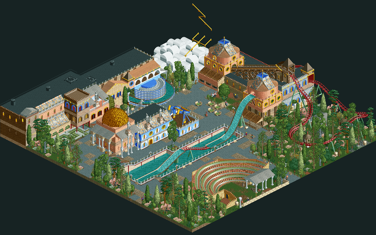
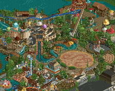
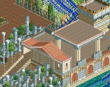
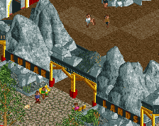
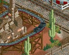
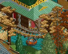
This is my attempt to the survivor contest on Tycoon Paradise server 1. A Roman-mythological themed watercoaster.
Neptunalia was a Roman festival to celebrate the summer and ask Neptune for water. It's celebrated on the 23th of July, but the contest ends in two days. That's why I show you now.
Except for the paths and black tiles it's ncso. -
 Full-Size
-
1 fan
 Fans of this screenshot
-
 Tags
Tags
For a bigger screenshot, click below:
Not too bad. You have some good skills built up and a lot of the design choices you went for are really good, but there's no cohesion at all. Some of your layering could have been a lot better as well. Didnt really like the use of the brick as a buffer between stories. Foliage is really weak as well. I'd like to see a more conscious effort from you, as i feel it's not right to judge your skill based off of this micro.
Okay thanks, I suppose that's not something I can change right now, more something I can learn.
alot going on here....
-Interesting use of trackature for seating @ lower right, but it seems overpowering for the area involved.
-The columns at the 3D structure really should match as far as pedestals and top of columns.
-The roofs with the two statues seem a bit broke up... the statues maybe shouldn't be there and thus filled with more roof area.
-All the roofs against the flat roof structure should technically be above the flat roof. You shouldn't see the wall behind the roofs.
-The roofs that are mixed with tile and shingles or wood. Pick one or the others.. Roof materials with typically match for that structure.
I still like this... Shoguns? said it well. COHESION.
Your a thinker though, and that's GREAT!
Wauw, that are a lot of tips, I can do something with that! But I don't agree with the last two tips you gave me. I like it, though I can at least make that roof a bit lower so the wall will be smaller.
no no no.... make the roofs in front of the flat roofs higher so the flat roofs are not seen from the paths... if I understand you correctly....
I like it now.... just a suggestion.
I'm only talking about the roofs top left of center as being above the flat roofs