Screenshot / LunaPark Adelaide - Midway
-
 22-June 17
-
 LunaPark Adelaide
-

 2 of 8
- Views 4,842
- Fans 11
- Comments 20
-
 Description
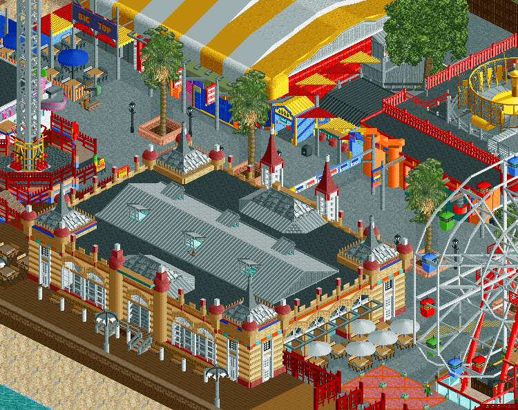
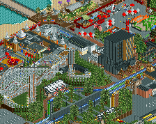
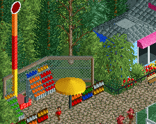
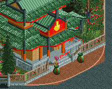
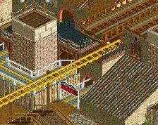
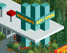
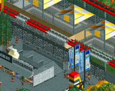
Pictured is the midway in LunaPark.
Taken almost straight from LunaPark Sydney, this small portion of the park still packs a punch. Featuring a 155ft drop tower, the park's iconic Ferris Wheel, Big Top Circus, and the Crystal Palace Arcade, as well as midway games and the round up ride. -
 Full-Size
-
11 fans
 Fans of this screenshot
-
 Tags
Tags
Great use of colors!
This is killer.
This is probably one of the best screens posted in a good while, just about every building is fantastic, plus the shadows and colors really make it something special.
Two things:
Find a way to break up the black flat roofs slightly, maybe some 1k netting patches, or black road lines. Something to just break up the texture a bit to balance it with the rest of the screenshot.
The beach area is super plain and dull compared to the midway. I'm sure its just unfinished, but it will really need some strong details to match the park area, which I'm sure you can add.
Is the ferris wheel working?
Damn dude, very similar to the idea I had for a ferris wheel that I'll be working on soon. Very nice archy and details.
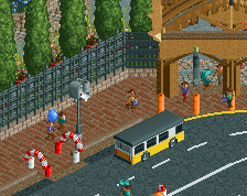
Merging three trees into one is just ridiculous and messy. The rest is perfect. I love the scale and the cozy atmosphere. Probably one of the best boardwalks I've seen in RCT. Maybe even the best. Just needs peeps.
This sucks!
And I could never be more wrong!
Pretty bitchen!
Beautiful!
The thing I like most about this is that it seems pretty similar to your first park (With the orange Dodgems building) in terms of colours and atmosphere, but it really shows how far you've progressed. Awesome.
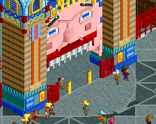
I'm in love with the building on the foreground. The colours, the details, the shape... All of it works for me! Amazing job!
Really nice overall. I think black on the outline support ring on the wheel would look better, too white atm. Takes balls to do this theme after where Alex set the bar.
Thanks for all the feedback everyone, this park has really come together despite originally being a bit of an experimentation rather than main project. Turns out google street view is really useful haha
@G: Yep, you're right the beach stuff is unfinished. I'm still in the process of working out how to flesh out the beach in these areas because I can't realistically rely on rockwork like I did in the other screen. Will try to figure something out for the roofs.
@nicman: it is indeed a functional ferris wheel. OpenRCT made it super easy to get working
@Sulakke: thank you! It appears we have contrasting opinions about merging trees haha, I just think using a single tree seems so simplistic and doesn't provide enough substance. Will probably keep it as is because of that but hopefully that won't detract too much from you liking the rest
@trav: surprisingly not something I thought about at the time, but that's a really relevant point now you mention it. I'm super happy with how I've progressed since that first park and it means a lot to get recognition in that regard. Thanks
@Kumba: good call about the support ring, not sure if black might be too great a contrast but I'll play around with it a bit. I never really thought I was delving into Alex-territory in making this. Although the park shares the same name, the style and design of this (based on the two in Australia) will be a lot different to Alex's. I think the more colourful and almost 'county fair' atmosphere of the actual park contrasted by the [likely] surrounding cityscape will be very different to the more blended park-city that Alex created
Awesome.
Wow, superb screen!
I agree with Sulakke, you merged one tree too many. Stick with the two palm types, they work well together. In the same colour.
Good stuff.
This shouldn't work or look as good as it should. It's amazing that nothing sticks out or anything. The 2nd best ferris wheel we've seen on the site.
fan-fucking-tastic
my new favourite screen on NE. congrats.