Screenshot / Arrowhead
-
 19-June 17
-
 Fort Fun Adventureland
-

 6 of 6
- Views 2,825
- Fans 2
- Comments 13
-
 Description
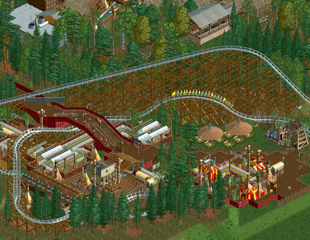
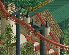
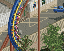
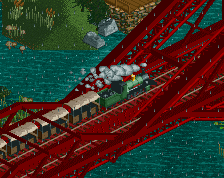
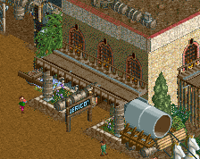
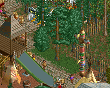
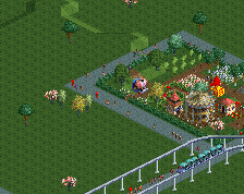
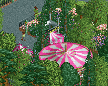
New for 1985 is Native Jamboree and Wagon Tours. This expands on our 1984 addition, Vermont's top thrill coaster, Arrowhead, creating a brand new area complete with a new snack bar and picnic area.
**It's been 3 years since the last update, 1985 is finally finished and will be released soon.** -
 Full-Size
-
2 fans
 Fans of this screenshot
-
 Tags
Tags
Louis! is back?
Simple but very nice. The only thing I don't like a lot is the foliage on the bottom of the screen.
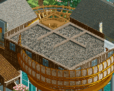
Surprisingly yes, it doesn't glitch at all. It took a bit of fiddling with the order in the tile inspector. Thought it was an interesting idea to play with to spruce up a stall.
I like this a lot, very simple but still very cool. Also the person who gave this such a low score should see a doctor, because there is clearly something wrong with him.
I'm a fan! The hotdog thing, wow.
Nice
This is a perfect example of 'Complete Screen' content ... it's self sustaining so to speak...
Interesting Ride! and I love the little picknick area!
i love it
So beautiful!
Yay! it's simple but reads really well