Screenshot / Infernal Views- Flame Street
-
 12-June 17
- Views 1,453
- Fans 0
- Comments 7
-
 Description
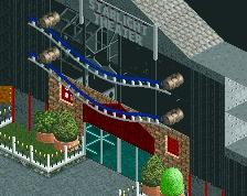
Excuse the unfinished top right and bottom left.
Hiya. Back again from the void.
I've been building on the best scenario in RCT2 casually and without much of a goal. This is what I've gotten so far out of the first little neck of land. I'm not entirely satisfied with it but it's not terrible (I hope) and I figured it was a good time to stop and get some feedback, and also to see whether this is worth continuing on with.
I'm still working on that awful glass cube map, by the way. -
 Full-Size
-
 No fans of this screenshot
-
 Tags
Tags
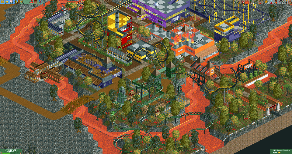
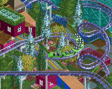
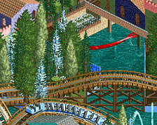
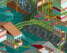
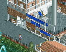
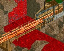
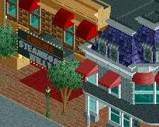
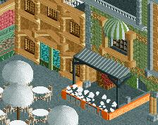
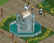
I really enjoy the corkscrew coaster! The interaction with the lava river near the half loop is brilliantly done! Overall it's colorful and the interaction is nice. I think it could be more refined in its style but that will come through time. Keep going!
I see some potential too. First thing I would change is the paths. Go with a uniform style.
I would say not bad but as for criticism, I'd the layout are the first thing to look at. I'm not really a fan of surreal coaster styles which is a personal preference but still, there's lots of kinks to overcome in layout building
Thanks for the feedback!
Fisch- Thanks so much for the encouragement. I'm gonna try to get the whole map more or less finished, I think it'll be good for me to get a large(r?) project done even if the quality is suspect in places.
Liampie- I changed the dirt paths to brown paving which is better and toyed with removing the crazy paving, but I didn't like just the flat brown. I'll keep experimenting with the paths, thanks for your comment.
SEP- What would you say needs the most improvement in my layouts? Are they too spread out or too unrealistic or just plain ugly, etc?
Here's the opposite angle. The thing I most want feedback for is the foliage- is this combination/colors good or do I need to try some more options? Once again, please excuse the unfinished parts at the top and bottom.
Foliage is good I think, perhaps a bit lacking in underbrush, but it actually sort of works well here.
The most questionable part of the layout is the corkscrew immediately preceding the loop. Aside from being an unrealistic inversion sequence, the train must be traveling at a very fast speed (for a small corkscrew) in order to make it through that second loop, back through the second loop again, and finally through the first loop. In order for the train to successfully travel backwards through that final loop, it must first travel forwards through that corkscrew at a speed even the game deems unsafe.
G Force- Good to hear that, I'll keep fiddling around with underbrush, I agree it should be thicker too. Thanks!
Terry- Believe it or not, that coaster actually has an intensity around 8.5, although it's still pretty high. It's definitely unrealistic and it admittedly crawls through the first loop on the way back (a lot of the coasters here are pretty poorly paced if I'm being honest) but I think I'd rather trade the look of the coasters for a few worthless peep spines. Thanks for the layout tips, I never really consider the coaster's speed at any given moment which is a habit I really should kick.