Screenshot / Outdoor Tables and Pumpkin Patch
-
 05-June 17
-
 Legend of the Lake
-

 2 of 4
- Views 1,864
- Fans 1
- Comments 8
-
 Description
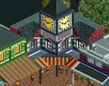
Dining area complete with three different trash receptacles: landfill, compost, and recycling. Pumpkin patch is stocked with plastic "impersonator" pumpkins during the pumpkin off-season; nobody could possibly tell the difference from this angle.
-
 Full-Size
-
1 fan
 Fans of this screenshot
-
 Tags
Tags
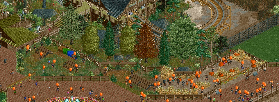
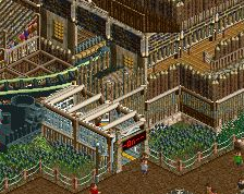
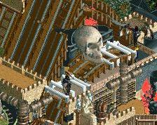
I think you've gone too far with the grass here. As well as green in general... try painting the tops of the plank objects brown and the roof on the left side a different color all together.
The green was to give it a (fake) mossy, weathered, unkempt look, though the texture may have worked better on the roof than it did in the station.
This is what it would look like with brown planks and a grey roof on the entrance building instead of moss green:
http://i.imgur.com/W8PGyQP.jpg
I like this a lot. The grass textures are fantastic, really well done there. Superb work.
Amazing work, I like the ground textures a lot. For me the problems are the building for the roller coaster entrance that looks too simple and the empty area on the right which is too clean compared to the foliage next to it.
This is some of the best autumnal stuff i've seen.
that building on the left looks a bit off though.