Screenshot / Greetings!
-
 27-May 17
- Views 1,783
- Fans 0
- Comments 3
-
 Description
Hello everyone! Its been a while since I last spent time working on this game but I've been finding time and inspiration to start building again. I used to be quite active on the old Atari and TPR forums before they died. So NE is the obvious stepping stone to improve one's talent!
Regardless of all that, this screen is heavily inspired by Hemingway's The Old Man and the Sea. It serves as the ride's main entrance and features a small shop, a terrace restaurant, and a fish market which the ride's queue passes through. -
 Full-Size
-
 No fans of this screenshot
-
 Tags
Tags
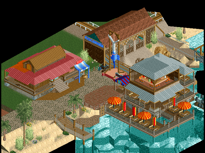
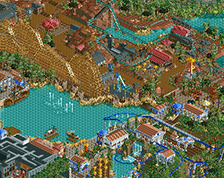
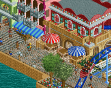
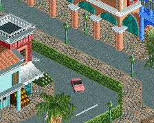
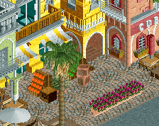
Good start. However, there is too much paths textures, it's misleading for me. Colours are a bit weird (umbrellas and awnings don't match imo). I would also change the grey roofs to something darker.
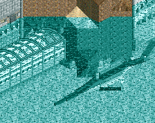
The underwater part is really cool on the other hand. Good for a first screen!
Some nice stuff here, seems like you've already got a good handle on the objects and stuff in game, which is great.
Other than it feeling a slight bit rushed or unfinished, especially with the foliage, it is quite nice. Though, the red roof on the left has a bit of orange on the corner, not sure if that is intentional or not.