Screenshot / LunaPark Adelaide - Beachfront
-
 25-May 17
-
 LunaPark Adelaide
-
 1 of 8
- Views 3,157
- Fans 2
- Comments 21
-
 Description
LunaPark has been built in Sydney and Melbourne while the Gold Coast has Movie World and Dreamworld. Unfortunately, my home city of Adelaide lacks any themepark let alone interesting coaster-related attractions.
Trying to incorporate elements from other LunaParks into an Adelaide-inspired and located environment.
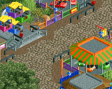
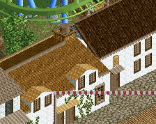
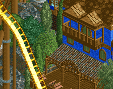
Pictured is the beachfront leading towards the LunaPark entrance. Not a recreation, but the buildings/structures/location is heavily inspired by real life locations. -
 Full-Size
-
2 fans
 Fans of this screenshot
-
 Tags
Tags
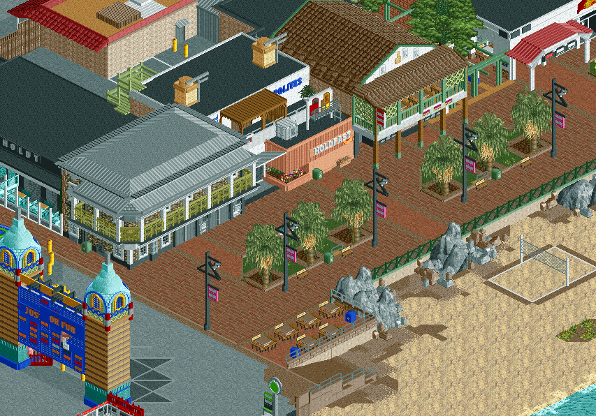
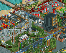
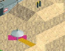
The textures on the beach are phenomenal.
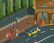
Only thing I'd suggest is either swapping the queue rails around the seating area to that metal and glass fence you used next to it, or simply paint then black instead of gray.
My only suggestion is to maybe smooth out the textures on the beach just a little bit. The idea is great, but it could be even better. Maybe try more tan colors as a buffer from the bright sand to the darker textures near the rocks?
Great work dude!
That beach atmosphere has me feeling like im legit there, awesome stuff.
I was thinking that some foliage like this could be a nice addition. Thoughts?
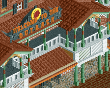
The entrance structure seems too forced to me, atmosphere is fantastic otherwise.
Also consider to rise the palm trees a bit, I understand what you're going for but it was sunkened way too much.
Cool trash bins, cool tower tops, cool layout... very creative
radelaide
Some relevant comments here: fair call about using some brown grass, raising the palm trees, and adding some tan. Still need to work out how to add aesthetic air-conditioning ducts.
Unfortunately @pierrot, imo the real life equivalents of these entrances are literally placed on tarmac. It's less of a solid, ornate structure and more of flimsy obviously man-made archway. Nicely built, but not nicely incorporated into surroundings. Hopefully seeing it more contextually with actual "within LunaPark" content will help a bit.
So great, even if this screen could have been 3x better with peeps. Can't wait to see more.
I like the palm trees and the sidewalks! I sometimes wish that texas would have and older park like this but my guess is no because of the 1900 Hurricane back then!
I'm not a fan of the road lines used around the dirt areas; feels very unnatural. The rest looks very nice!
It's quite hectic exhausting to look at, even without peeps. Paradoxically I think this screen would be better with peeps.
show us the front face ya pleb
^there's unfinished shit in that view haha, soon.tm
@CC9 keeping the road lines was an oversight, thanks for pointing it out
@Liam any way to make it seem less exhausting to look at (obviously peeps will be added in the end, would that be enough to help it?)
Jus or fun? That is the question!
Also I love the sunken palm trees, can't see what's bothering about them!
Shameless alt. angle plug: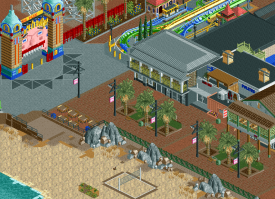
Now you see, I don't think trams run on multilayer B&M track
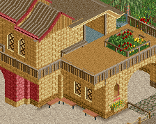
Really good stuff, the face is great. But the buildings look a bit...strange. I can't put my finger on it, but I think Liam said it best. I don't think they really match.
Nonetheless i'm interested in this. I wanna see more.
Love this Stoksy. Only thing I have a problem with is the imbalance between the bright colours around the gate and the relatively dull colours of the boardwalk/beach area. Is there any way you can add some bright detailing to those buildings or the path? Even just some coloured bunting might be enough.
Edit: the face is excellent.. you couldn't resist showing that off eh?