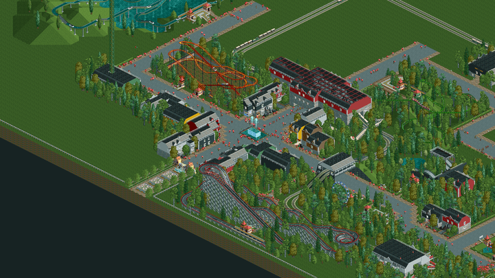
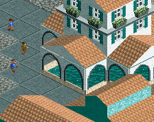
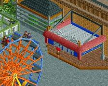
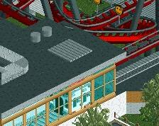
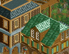
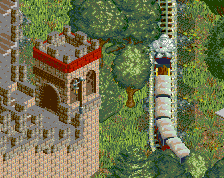
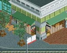
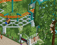
Screenshot / Entrance area
-
 22-May 17
- Views 1,329
- Fans 0
- Comments 2
 2 Comments
-

 Comment System
Offline
comment below
 -

 Liampie
Offline
That's a pleasant looking area, but I guess that it looks quite awful zoomed in because of the awful objects you used. I see the potential but the expansions objects are holding you back, soggy pear.
 -

 Soggypear
Offline
Ok. I'm going to try some custom scenery next.
