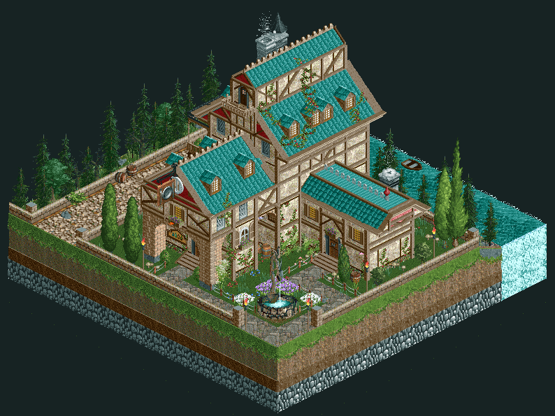
Screenshot / Medieval Fantasy Villa
-
 21-May 17
- Views 3,118
- Fans 9
- Comments 16
-
 Description
Hello! Been more than a month since I last showed anything, so here we go.
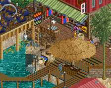
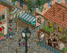
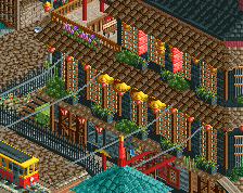
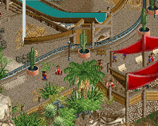
I always wanted to try a sort of 'diorama-esque' method of building. The main idea was a medieval, fantasy style villa with a layout like the ones in isometric RTS games (the citadel/main town centre buildings), but I suppose somewhere along the line the roofs added a faint touch of asian as well.
P.S. - The Venice project is on hold right now because the PC broke down. I need access to Assassin's Creed II in order to move forward on that :P In the mean time, I wish to try little ideas like this one. Should I go on with this micro/diorama concept? -
 Full-Size
-
9 fans
 Fans of this screenshot
-
 Tags
Tags
Muy bien
Honestly you can't leave this like that. You have to make a full design entry with this. Expand the map, create a mountainous landscape and be our hero. ♥
This is so beautiful and well scaled, it can't remain only in a micro concept.
I would give you a Wow Wally gif if I had access to a computer
So gooood!
Fantastic. Keep em coming.
Now that is something else. Well done.
Can you make this... but like bigger?
Awesomely crafted piece of art!!
Lack of context kinda kills it for me, not really seeing why this is a villa when you've got a restaurant sign and if it's a villa-turned-restaurant then I imagine access would be easier.
It's very very good architecturally, but on its own doesn't do much for me. Too much focus is on individual elements rather than the whole picture. Even if it only becomes a village, like 20x20, or small park/design the archy would be much more impressive to me.
Thanks a lot, guys. I'm so very glad this is received well so far!
@Julow: Not sure I wanna take on an entire design entry yet, I'm pretty bad with roller coasters
@][ntamin22: Then I shall have achieved my park objective, so to speak :)
@Mr.Brightside711: Haha, I can't help but feel this is sarcasm since the main thing that bothers me on this is the inaccurate scaling of things. Everything is too large!
@Stoksy: Ah, I was worried someone might catch me on my use of the restaurant type sign. You see, to compensate for the large (read: inaccurate to RCT) scale I was backed into a corner when choosing a sign object there. Why have a sign object at all? Seeing as this was supposed to still be the town centre/citadel in my eyes, I just thought a sign couldn't hurt. It just happened to be a sign with a plate, a fork and a knife. '^_^ This of course means I should have been more careful in the execution of my original idea. Thank you, I will certainly see where I could have improved on this. I'll try and see if I can implement this concept for a slightly larger area, thanks for the suggestion!
PS: I thought I should also show the back, seeing as the whole thing is too small anyway, so here we go:
Kind of odd you don't have any windows or balcony's overlooking the water.
I think it would be a lot better if you moved the balcony to the other wall.
Very cool building, nice work!
Wow, this is new. Extremly clean and nice. Refreshing aesthetic.
<3
Very cool, hope you can use this or this style somewhere in the future!