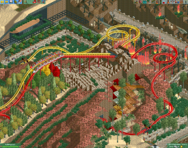
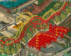
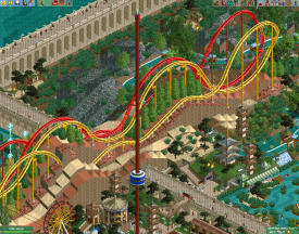
This is a good step. As far as criticisms, I'd say still less trees, The invert seems a bit short, and the shot is still pretty crowded with rides which doesn't really help. However, the dueling inverts are a big step in the right direction. However, it is also a good idea to separate the track at some point like the actual Dueling Dragons, that really spices it up. Take it from me, I love racers and duelers but you want to find a good balance of sameness and difference. Also, I've said this before but I'll say it again, try building just one or two layouts in a blank map. The terrain and other rides tend to limit more than help unless you really know what to do with them
Yup, better, still try for less trees or least lower profile trees. As far as the dueler, more separation is always good, especially if there are parallel curves. As a suggestion, at the point where the parallel curves start, run the track opposite and then return to parallel. You can use that for some separation and the dueler will be better balanced. Yea I know, that was clear as mud...
The duelers are literally rides that are in the original scenario. I think the only modification I see is that the colors are brighter and the first drop is lower. The new interactions are nice, but I'd like to see more original work than basically recoloring Chris Sawyer's.
I'm posting this comment in this screen because your other screen is locked.
I apologize for my comment on your other screen. I was in the wrong frame of mind (omg not me.. yea me) to comment when I did and I should have not said anything. For god's sake's, I'm no better than anybody else out here! Moreover, I think all designs are great from all builders, regardless of what the hell its really supposed to be! As long as the builder has fun building, there's a thousand ways to build the same scene. I hope you keep having fun and you keep posting what ever screen you want to post! And again, I Apologize.
It's fine i understand, & not everybody likes what everybody likes, & im happy being below, & negative!
As a long time lurker (2-3 years - and recent profile maker) I have to say it's refreshing to see actual critiques and suggestions on a newer New Element player's work instead of hateful comments. I might actually post something for once. Keep it up History and take some comments under advisement. Earning rep in the community means listening to other people's suggestions and implementing them. Keep up the good work.
I decided to keep these but kind of re modified them a little but i know theyre not very dueling like Dragon Challenge from IOA but at some part it becomes that way!
This is a good step. As far as criticisms, I'd say still less trees, The invert seems a bit short, and the shot is still pretty crowded with rides which doesn't really help. However, the dueling inverts are a big step in the right direction. However, it is also a good idea to separate the track at some point like the actual Dueling Dragons, that really spices it up. Take it from me, I love racers and duelers but you want to find a good balance of sameness and difference. Also, I've said this before but I'll say it again, try building just one or two layouts in a blank map. The terrain and other rides tend to limit more than help unless you really know what to do with them
Yup, better, still try for less trees or least lower profile trees. As far as the dueler, more separation is always good, especially if there are parallel curves. As a suggestion, at the point where the parallel curves start, run the track opposite and then return to parallel. You can use that for some separation and the dueler will be better balanced. Yea I know, that was clear as mud...


It can be subtle or whatever.
Just an idea for ya... This area isn't finished.
Not enough trees
Also, Spiffy Jack: Mirror Coasters are boring
Its just an example. It may mirror, but the trains have minimal exposure to each other...
I'd love to see more scenarios with just different colours and trees on every tile.
Hey historyfreak92,
I'm posting this comment in this screen because your other screen is locked.
I apologize for my comment on your other screen. I was in the wrong frame of mind (omg not me.. yea me) to comment when I did and I should have not said anything. For god's sake's, I'm no better than anybody else out here! Moreover, I think all designs are great from all builders, regardless of what the hell its really supposed to be! As long as the builder has fun building, there's a thousand ways to build the same scene. I hope you keep having fun and you keep posting what ever screen you want to post! And again, I Apologize.
It's fine i understand, & not everybody likes what everybody likes, & im happy being below, & negative!
As a long time lurker (2-3 years - and recent profile maker) I have to say it's refreshing to see actual critiques and suggestions on a newer New Element player's work instead of hateful comments. I might actually post something for once. Keep it up History and take some comments under advisement. Earning rep in the community means listening to other people's suggestions and implementing them. Keep up the good work.