Screenshot / Die Altweibermühle
-
 12-May 17
-
 Erlebnispark Haslach (Finished)
-

 2 of 6
- Views 3,028
- Fans 0
- Comments 21
-
 Description
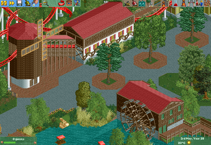
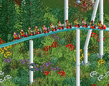
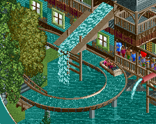
Opened in June 1929, the "Altweibermühle" is said to be the oldest theme park attraction in Germany. The slide attraction was also the founding stone of the Erlebnispark Haslach, built near the city of Hohenhaslach in Swabian vine country. Sadly, the original mill was hit by a lightning in 1946 and burned to the ground.
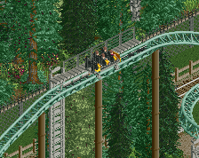
In 2016, the park management decided to build a replica of the original mill to serve as a lift-building for their newest attraction, the "Mühlenritt", which is a Mack coaster featuring a LSM lift and a LSM launch. -
 Full-Size
-
 No fans of this screenshot
-
 Tags
Tags
![screen_3610_El Diablo & Casa Magica [WIP]](https://www.nedesigns.com/uploads/screens/3610/3610_thumb.png)
Yeah, it's pretty worthless right now. The only really interesting thing about it is the brick path under the windmill if only because of how bizarre that choice is
Technically, this is very good. But like Scoop said, it needs life. Add benches, stalls, bins, lights and peeps!
Also, some colourful flowers could help to make this pop more. Nonetheless, you're improving!
This is often how most great parks look before they receive a bunch of details, so you have an excellent base here. In addition to the details Jappy suggested, the buildings need more character, more trims, variations in the roofs, add fences etc. I would also make the shrubs going into the water a little more rugged, add some grasses, smaller bushes to make it look a touch overgrown. It also looks like the coaster supports are almost singular poles, so that would need be improved... and of course the peeps!
Great start, keeping breathing life into it
To say it's "pretty worthless" is quite harsh and not true in my opinion. It's a very good start. However, it needs refinement and some life as others have suggested. I'm really looking forward to see more from you.
I would say it's got very little of any value. And this is coming from the person who told me to have thicker skin. If he can't handle the fact that this screen is pretty gosh dang bland and downright bad, he should get out of the kitchen
I honestly don't care how bland people think it is. I like what I built and as far as I'm concerned, that's good enough.
So why post it if you don't care about criticism. That might be the reason you're not producing screens with much of value
That's not how criticism works. Criticism isn't a two way stream. People give it to me and it's my job to decide what I want to accept and what I wan to ignore.
Interesting idea. I'd suggest some horizontal trims and small windows for the tower. That is an iconic building and should therefore have some more details. I don't think the rest looks too bland. Interested what you are gonna do with Altmännermühle.
I like this. It may be a little bland, but peeps will help that a lot. I think maybe a few windows on the station and windmill would go a long way though.
PS: I agree with Liam, this score is way too low.
I think you're showing great improvement, and also that the score here is too low and definitely lower than what the panel would give you. In fact I think many people could take your screen as an example on how to mix road textures.
You're onto something, but you have to polish it some more. Use dark red for the track's rails, add path attributes like benches and signs, a window where a wall is looking too plain, peeps, and this will come alive.
I just want to state here that I do benches, peeps, etc. the last on purpose. Posting screens is great to get feedback (and maybe build some hype) but I still want to give people looking at it for the first time a different experience then what the screenshots give.
There's definitely something present to make it great. For now, it's a bit bland. It needs more details to make it pop like benches, signs, maybe even stalls on the path or that kinda stuff, colorful flowers,...
I like the idea of the lift going trough the windmill, though the building itself could be a bit smaller imo. Buildings need some more detailing too, not so much work to add but it could make it look way better.
It's an amazing start, It just needs more details but what's here is nice, I like the foliage near the lake. Otherwise I'm really not a fan of the colors of the coaster and the supports, but that's subjective.
You're on a good way Version1! It's a nice start, now add some cool details and life to it!
Don't understand some of the negative not so constructive comments overhere, don't feel like they are having any value...
What a weird theme! But I like it. As others have said, you have a solid base, now add those details and this will probably look very good.
SensualEtc.: Honestly you're not that much better yourself... To me this looks very similar to your work. I think you're being way too harsh here.