Screenshot / Whirlwind - "Ride the Wind"
-
 10-May 17
-
 Sugar Creek Park
-

 2 of 2
- Views 1,771
- Fans 0
- Comments 10
-
 Description
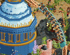
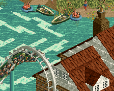
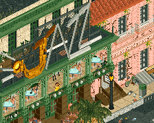
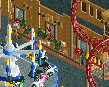
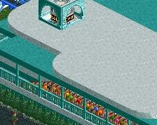
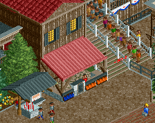
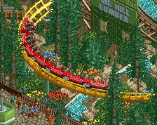
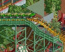
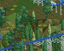
Ya'll Come take a spin on our classic arrow looper, Whirlwind. This ride will flip and spin you around so much you may fly right out of your seat. When your done you can come take a bite to eat at The Crab Shack right across the way. There are Plenty of pickings to choose from, such as our classic low country boil or any of our many types of PO-Boys. You could even eat before you ride and test your strength (Stomach strength that is) to see if you have what it takes.
-
 Full-Size
-
 No fans of this screenshot
-
 Tags
Tags
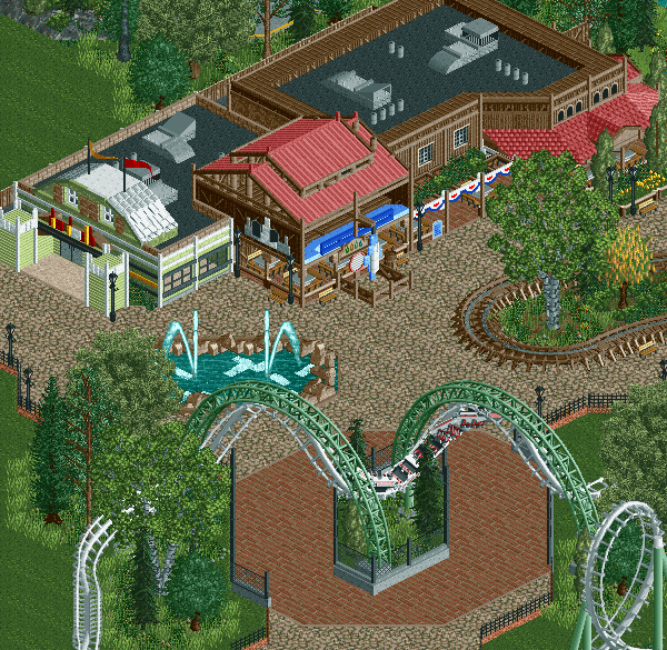
I'd also wish you'd did a bit more natural blending with the grass and underbrush. The fact it just ends in neatly kept angles and lines is a bit unnatural feeling.
I quite like it. That planter rights needs some bright flowers! The foliage in general could use some more color. Looking forward to see more Scoop.
I like this, but I ditto everthing said. Some more colour would help this a lot.
Foliage could definitely be improved. For the architecture i don't know if it's cool or weird, but i kinda like it!
Overall good stuff!
Something about this just... Isnt coming together. It's not bad or anything close, but parts of it just feel way better than others. The thumbnail is fantastic. The planter may be part of it.
Try this - ditch the dormer roof over the bathroom entrance, just make that building flat roofed and nondescript. I think there is too much busyness in that section, without it being a distraction the focal point of the screen, the thumbnail, will PAWP a little more.
I like this, did you just start it ? If yes, it's a good start.
The path under the corkscrews looks a bit forced for some reason. Not sure what to do about it. Rest looks nice. I love the brown buildings with all the tables, however, the screen screams for peeps. Anyway, good job.
I didn't even think about using this view instead.
it looks soooo much better.