The foliage especially. I'm not sure if it seems messy to me or off color-wise, but those burning bush trees don't fit in with the RCT graphics at all - a shame really, because they add some great color to the area.
The slide doesn't fit at all, neither do those orange trees.
The rest is really nice, though I'd prefer you replace the dark brown path with the one you used in that queue in the upper part of the screen. It would blend a lot better.
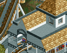
Slides colours are awful lol, map racks as roofs works really well. The colours of that custom tree are probably suitable, but the texture is trash (like the purple tree you used in FUCK).
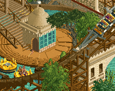
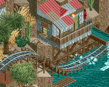
Very nice screen, Fred. I kind of like the first screen better. I like the contrast the dark path creates, but I can see why people would prefer crazy path. Glad you're keeping the trees. I quite like them. Add some peeps, tables, light posts etc and you'll be fine. Good job.
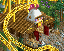
+1 for the queue with the soda vending machines, I know it's just a detail but I love it when people put them in a really themed queue, not just generic.
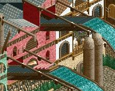
The slide doesn't bother me so much, but that orange tree really sticks out in a bad way. But maybe I'll get used to it like I did with that purple tree that was in vogue a while ago... Anyway, much better after the path change! Looks good, looking forward to see more!
 09-May 17
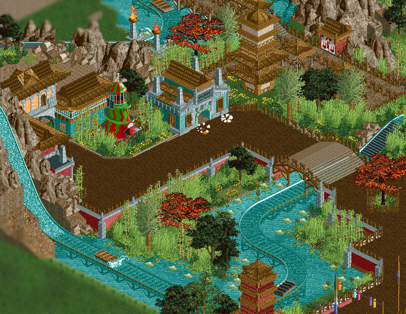
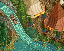
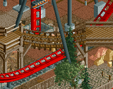
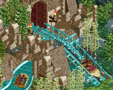
that slide color is just bleh
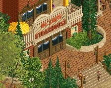
This is very weird, to me.
The foliage especially. I'm not sure if it seems messy to me or off color-wise, but those burning bush trees don't fit in with the RCT graphics at all - a shame really, because they add some great color to the area.
The slide doesn't fit at all, neither do those orange trees.
The rest is really nice, though I'd prefer you replace the dark brown path with the one you used in that queue in the upper part of the screen. It would blend a lot better.
Either you change the foliage or you change the paths, the contrast is a bit hard right now. Loving this project by the way.
I do like the slide and the path, but the red trees look horrible. There should be a better tree object to have something like that.
Redid the path. Going to keep the orange tree, I like it.
idk man that slide is throwing the area off just a bit.
Much better.
Slides colours are awful lol, map racks as roofs works really well. The colours of that custom tree are probably suitable, but the texture is trash (like the purple tree you used in FUCK).
I'm torn on this screen, like the other comments, but this screen does have some promise to it.
Very nice screen, Fred. I kind of like the first screen better. I like the contrast the dark path creates, but I can see why people would prefer crazy path. Glad you're keeping the trees. I quite like them. Add some peeps, tables, light posts etc and you'll be fine. Good job.
+1 for the queue with the soda vending machines, I know it's just a detail but I love it when people put them in a really themed queue, not just generic.
The slide doesn't bother me so much, but that orange tree really sticks out in a bad way. But maybe I'll get used to it like I did with that purple tree that was in vogue a while ago... Anyway, much better after the path change! Looks good, looking forward to see more!