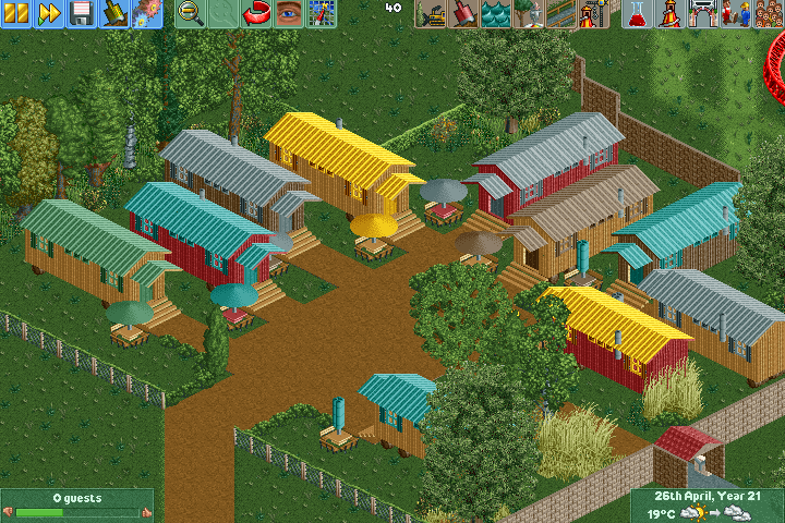
Screenshot / Die Schäferwägen
-
 02-May 17
-
 Erlebnispark Haslach (Finished)
-
 1 of 6
- Views 1,709
- Fans 1
- Comments 10
-
 Description
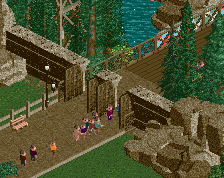
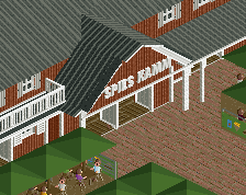
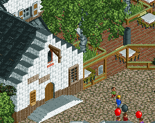
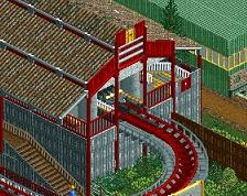
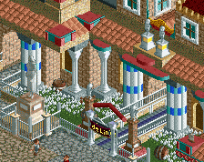
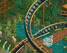
"Come and spend a night in one of our Schäferwägen. A unique way to spend the night right next to your favorite theme park!"
The first screen of my next park I'm sharing here. At the moment the park is called "Project Accolade" since it's supposed to finally earn me my accolade ;) -
 Full-Size
-
1 fan
 Fans of this screenshot
-
 Tags
Tags
cute
Cool, do something with the path in the middle and it's perfect!
Very quaint and cute, only thing I would suggest is to break up the path a bit to make it seem more natural and then add some variance in terrain paint
Cute but a little underdone. Might wanna throw that on the grill for a little longer. Buildings are a little too plain but not bad by any means
Good start. Some slight variations in size and shape of the RV's, and some more grittyness would help this a lot I feel.
It seems a bit underdone in a way. It's not bad, but I'm really not sure about that front brick wall (especially the roofing element), it doesn't seem to mix in well.
A great start!
Structurally, the awnings look like they extend too far off of the wall to be supported by just the wall. I would consider some vertical supports connecting to the ground, or diagonal supports connecting to the lower section of the wall next to the door to bolster them.