Screenshot / Striker "Light the Fire!"
-
 01-May 17
-
 Sugar Creek Park
-
 1 of 2
- Views 1,842
- Fans 0
- Comments 12
-
 Description
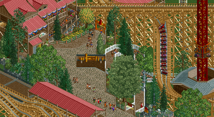
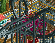
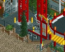
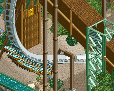
"Fire in the hole!" take a ride on the wild side and "feel the rush" of our newest wooden coaster "Striker." This is a relentless ride that will "spark the fire within." If coasters aren't your thing then experience the thrill of launching upward at "exploding" speeds on "Firecracker", an S&S Launch tower that will have you scream louder than any of those discount fireworks.
-
 Full-Size
-
 No fans of this screenshot
-
 Tags
Tags
This looks fantastic, tho I do have to say, assuming it is indeed a GCI, that transfer table is inaccurate
This seems like a step back again... Fences and paths are a total mess.
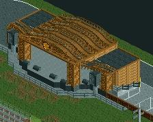
This screen looks pretty good at first sight. But taking a closer look I realize Liam is right. The fences and paths are mess. I can't figure out what the brown path with golden thing on top is either. The station building looks pretty good though.
You would know for sure wouldn't you
How so?Path feels really messy to be honest. In my honest opinion the diagonal sign is also not really working. Foliage also feels a bit too much.
Nice station building though.
In reference to Liam's comment about fences; there are quite a lot within this small area one fence type for one queue, another fence type for the other, one fence type for each side of the path - it diminishes the coherence a bit.
Just looks like G Force work to me, except G Force does it much better.
I like it. The S&S tower is a bit iffy. The structure seems to bulky and plain and a weird shape.
Everything else is nice