Screenshot / La Bestia
-
 28-April 17
- Views 2,090
- Fans 0
- Comments 4
-
 Description
I readied my Disaster Bench park for submission (read: i added a few trees and gave everything a Spanish name even though nothing in this park has anything to do with Spain but i was too lazy to actually come up with some good ride names).
So yeah, it's been submitted now! -
 Full-Size
-
 No fans of this screenshot
-
 Tags
Tags
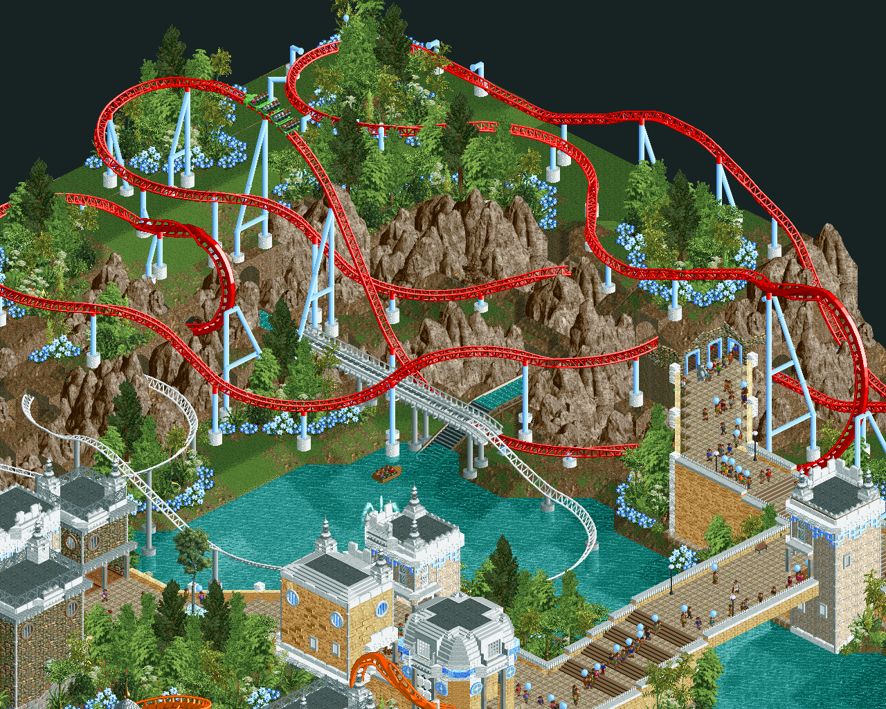
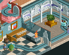
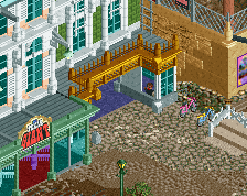
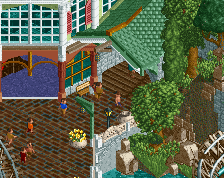
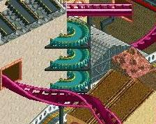
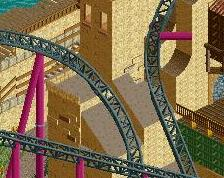
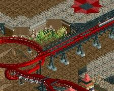
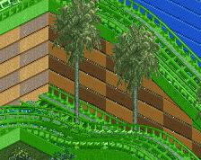
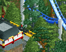
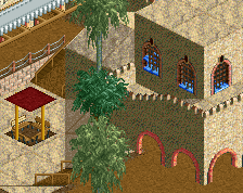
This screen doesn't do a lot for me to be honest. The coaster layouts seems to be really uninspired. They are just there. Especially the water coaster seems really out of place and built without any thought. And the same goes for the landscape. There are three types of landscape here (foliage patches, cliffs and bare ground), but no real transitions. It makes this screen feel a bit empty and unfinished. I really liked the other screen you posted of this project, but the architecture in this screens looks rather blocky. All walls are really empty and flat compared to the roofs. It is kind of similar to the landscaping in this screen: details are good, but very clustered and limited to some smaller aspects, while other areas look bare and don't have any details. It results in an incoherent whole.
I agree with Sulakke. Love those flowers though, they look magical.
i really love how the doorways go into the tunnels like that.
the big weakness in this screen is the layouts. it certainly looks magical though, so the palette is good