Screenshot / JWAK - The Western frontier
-
 24-April 17
-
 Jappy's Wildland Adventure Kingdom
-

 8 of 14
- Views 1,648
- Fans 2
- Comments 15
-
 Description
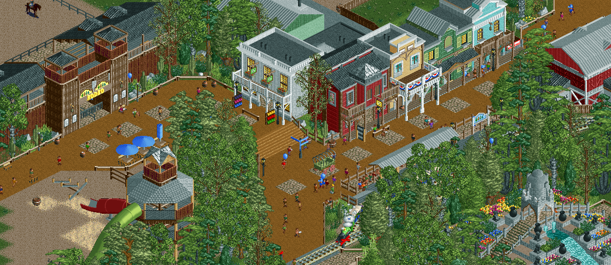
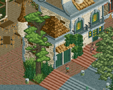
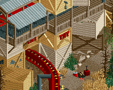
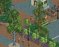
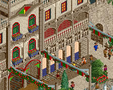
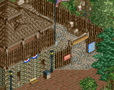
Come along and discover the wonders of the Wild West in Jappy's Wildland Adventure Kingdom's American area! Have a nice meal in the Country Cantina, find a great souvenir in the General Store, have some fun on our playground or enjoy our amazing rodeo show!
-
 Full-Size
-
2 fans
 Fans of this screenshot
-
 Tags
Tags
Beautiful. Not sure about that custom horse object in the top left. No complaints about any of the rest.
Fixed it. Kept the texture, got rid of the pattern.
Probably your best screen yet. Really loving this area so far.
Liampie edit: no
Dude, dafuq.
Good screen.
If you've fixed the path as you said; perfect!
imo some of the best archi you've shown so far! nice mate
Awesome work
Amazing job dude! I love everything but the squares. I would use dirt path everywhere. Good work!
brilliant
This is great.