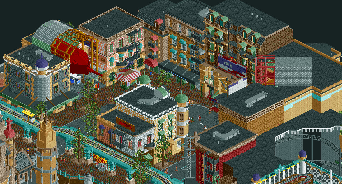
Screenshot / #fbf- Disneypunk
-
 21-April 17
- Views 1,570
- Fans 0
- Comments 3
-
 Description
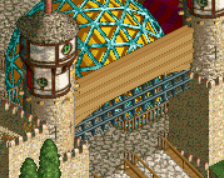
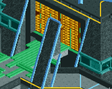
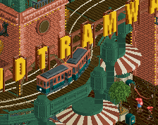
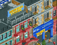
in celebration of the h2h banter in the discord, here's some stuff from the manual laborer's finals entry. the park didn't really do so well (for legitimate enough reasons) but I think it could have gotten there with a bit more cohesion, timing, and planning. I was relatively happy with this area at least, which was almost entirely my work.
I'd love to do this park again properly with some more control and time to really do it right. -
 Full-Size
-
 No fans of this screenshot
-
 Tags
Tags
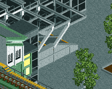
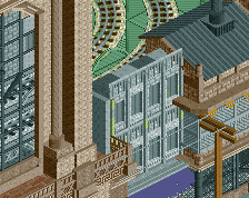
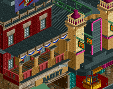
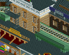
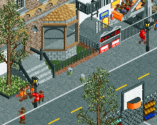
couldn't decide best angle, so here's a back view for some more details and the central building (which is placed so badly, should have had more space for it )
)
This park is so frustrating to me, just a bit more time and it could have been really special. Its good as is, but definitely feels very rushed and non-cohesive at times.
This was a tough map to finish cohesively- the idea was there but the final product ended up looking like everyone building on the map had a different vision. You crushed this part and although it gave me more of a DAW feel instead of "steam punk" vibe, it was still my favorite area in the park. If you want to revisit this idea count me back in.