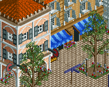
Screenshot / Venezia (Thieves' Den)
-
 12-April 17
- Views 3,452
- Fans 8
- Comments 21
-
 Description
Hello yet again!
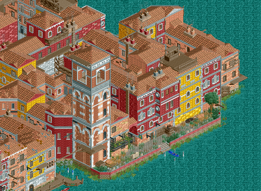
As a follow-up to the promise of looking at actual Italian architecture to make things accurate for once, this is my first project over at NE: the monumental task of recreating the entirety of Venice as it appears in the video game title Assassin's Creed II.
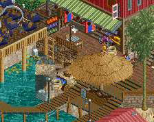
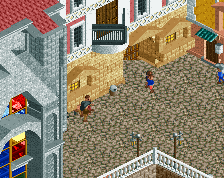
As the first screen for this project, it feels fitting to show where I started the project from: the Thieves' Den in the corner of the San Polo district of this fictional Renaissance Venice.
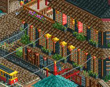
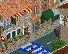
Due to the densely packed nature of Venezia, I would highly suggest everyone to look at all possible angles of this screenshot (and the project as a whole). I know my last screenshot was held back because of how densely packed everything was (the problem of not enough "room to breathe") so I may have disappointed a bit with the announcement of this upcoming project. Apologies on that end! '^_^
In any case, here it is. I would be really interested to hear opinions on this from anyone who has played Assassin's Creed II, as well as everyone else who hasn't.
My first focus is to apply my current skills at their best towards making a faithful translation of the entire city in all it's renaissance glory using handpicked objects. The scale (as compared to within the actual game) may be slightly larger, I've come to notice. However, while keeping accuracy at the forefront, I'm also keeping in mind to stylise the entire city as a whole to show the ideal version of ACII's Venezia. Though this does not mean I will add foliage everywhere and give colourful tones to buildings when the actual buildings simply have none. My current philosophy for this project is to give every part of the city a spotlight. The good should come with the bad, so to speak.
This corner in particular is probably one of the most decrepit areas in the entire city (except the entire Castello district) so go into it knowing this is the neighbourhood that the thieves of Assassin's Creed II's Venice lived in.
I may have shown part of this on the NE Discord Server (as well as perhaps the TP Discord Server) so to some, part of this may not be new. In any case, I really look forward to hearing thoughts on this!
With that said, do look forward to my showing of the Dorsoduro and San Marco districts. They are quite beautiful and posh and I'll try my best to provide a lot of eye candy for those sections.
Other angles in the comments. -
 Full-Size
-
8 fans
 Fans of this screenshot
-
 Tags
Tags
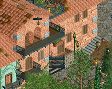
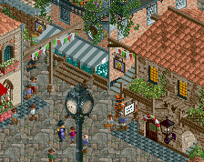
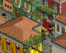
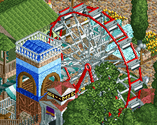
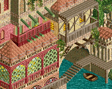
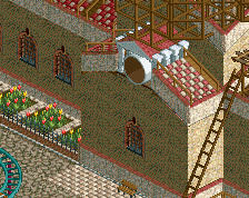
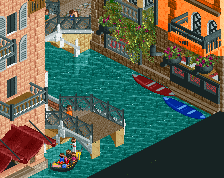
Sorry for the long delay in this response, I was thinking on which direction to take this project forward and I think I've got an idea.
You see, I was too busy recreating the bland world of ACII (no, seriously just look up screenshots of this game, the color grading is terribly weak). It's kind of like GTA IV, or Fallout 3. Anyways, when I look at this screenshot and then my last two ones, I noticed this isn't what I want to make. It's too lifeless indeed, and to hide that I even chose the thumbnail from the extreme corner, something that's clearly not the focus of the image, but was simply less bland than everything else and therefore had to go into the thumbnail.
Till now I've been convincing myself this place was bound to be bland ("Thieves' Den" and what-not) and my first aim being to replicate the ACII map to a 'T', even if the original source was a flawed one. I'll be trying my best to add some more colour and life to the project, however as a response to dr dirt; I'm afraid I can't do anything about
That does mean, though, that I have to put in all the work that would have gone to detail the inner alleys and allocate that time to make the boundaries of the city more interesting. Thanks for your comment!
As a collective response to the point of things looking too same-y, in these last 4 days I've realised I indeed should pick more colours. Some green, orange and blues would add a lot more to this project. At a time I was convinced since all ACII's Venice has are Reds, Yellows and Whites, that is all I'll use. I know that's not what I want anymore, so thanks for helping me find this out sooner rather than later, when I would have been much more reluctant to make such changes.
With that said, I still think I'll go ahead and work on the Dorsoduro District and make these recent changes over there instead and come back to this area later, in case I still think the same as I do now.
Thanks a lot for that, RWE. That is what has led me to rethink my vision on where the project is going from here on out. I think I'm going to take you up on that and make this much more impressive!
A last thanks to everyone for their helpful feedback!! I love y'all for taking time to post your thoughts on it, they're really appreciated and valued
PS: Thanks CoasterCreator9, I forgot about that, haha '^_^
This is excellent