Screenshot / Venezia (Thieves' Den)
-
 12-April 17
- Views 3,010
- Fans 8
- Comments 21
-
 Description
Hello yet again!
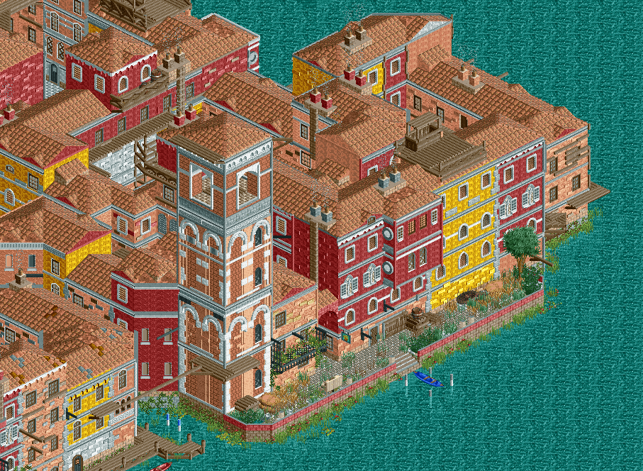
As a follow-up to the promise of looking at actual Italian architecture to make things accurate for once, this is my first project over at NE: the monumental task of recreating the entirety of Venice as it appears in the video game title Assassin's Creed II.
As the first screen for this project, it feels fitting to show where I started the project from: the Thieves' Den in the corner of the San Polo district of this fictional Renaissance Venice.
Due to the densely packed nature of Venezia, I would highly suggest everyone to look at all possible angles of this screenshot (and the project as a whole). I know my last screenshot was held back because of how densely packed everything was (the problem of not enough "room to breathe") so I may have disappointed a bit with the announcement of this upcoming project. Apologies on that end! '^_^
In any case, here it is. I would be really interested to hear opinions on this from anyone who has played Assassin's Creed II, as well as everyone else who hasn't.
My first focus is to apply my current skills at their best towards making a faithful translation of the entire city in all it's renaissance glory using handpicked objects. The scale (as compared to within the actual game) may be slightly larger, I've come to notice. However, while keeping accuracy at the forefront, I'm also keeping in mind to stylise the entire city as a whole to show the ideal version of ACII's Venezia. Though this does not mean I will add foliage everywhere and give colourful tones to buildings when the actual buildings simply have none. My current philosophy for this project is to give every part of the city a spotlight. The good should come with the bad, so to speak.
This corner in particular is probably one of the most decrepit areas in the entire city (except the entire Castello district) so go into it knowing this is the neighbourhood that the thieves of Assassin's Creed II's Venice lived in.
I may have shown part of this on the NE Discord Server (as well as perhaps the TP Discord Server) so to some, part of this may not be new. In any case, I really look forward to hearing thoughts on this!
With that said, do look forward to my showing of the Dorsoduro and San Marco districts. They are quite beautiful and posh and I'll try my best to provide a lot of eye candy for those sections.
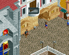
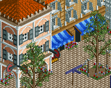
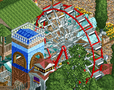
Other angles in the comments. -
 Full-Size
-
8 fans
 Fans of this screenshot
-
 Tags
Tags
Omg I just love it! Wow...
Very impressive; I do hope that the city gets some life at some point through peeps or named staff.
Very accurate and impressive.
Wow, accurately portrayed the density very well but it actually doesn't feel overwhelming and the sight lines aren't a mess. Really like this.
Wow, this is really spectacular.
I love builds like this, where the buildings all mesh together, and certain details are only visible from 1 or 2 angles. They're so much fun to explore.
My only real complaint is the transition from town to water. I understand you're trying to mimic Venice, but I imagine even that town has some real shore somewhere?
It's good, real good actually. I am missing the 'aliveness' though which CC9 alluded to. Flower boxes, open shutters, gondola's travelling along the water, clotheslines, will all really bring this next level. The ground level stuff is beginning to achieve this.
I also think your texture work could be an awful lot more adventurous and subtle. At the moment every building is made entirely from mud.
^ I agree with this.
I also think (particularly with it being a non-park) it's important to try and create as much storytelling with the details. Check out the way Riverland and Splashdown did this.
Great project anyway.
I think its very very impressive, but then at the same time, a lot of it converges together because of similar colouring and textures. Just try and vary it up every now and then and you'll have something spectacular.
I'm very glad to hear it's been received well. Thanks a lot to everyone so far!
@YoloSweggLord: Unfortunately, no. None of the actual city of Venice (as far as the game depicts it) has a clear, untouched shore. What must have been large shores are probably just ports for ships now, which I do plan on trying my hand at.
@CoasterCreator9: At first I was sceptical about adding peeps or named staff, seeing as those look to be from the 'modern age', but I'm starting to think I should indeed add some dynamic peeps (as well as some static ones here and there) to add some liveliness to the city as a whole. If there are any security guard peep objects, I might even place some at the roofs posing as archers!
In regards to the texture work, I most certainly agree with you, Stoksy but am unable to find a texture block I can feel represents the source material better. Everything in Assassin's Creed II's Venice looks old and decrepit at some level, even the best of areas. Apparently living in renaissance Venice wasn't that great an experience if the game is to be believed! I'll try my best, though I assure you. Would it be any consolation that I plan on using something different for the areas of the Dorsoduro and San Marco districts?
My first worry for the entire project is of everything looking too same-y and there being no real distinction between districts (even if I work on uniform variation throughout), which is why I've planned to make every district unique but having similar elements within itself instead. As it happens to be, the abundance of mud textures is a signature for the San Polo district. Thanks for pointing that issue out, though! I'll be looking out for ways to make it more interesting for the viewer still.
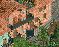
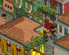
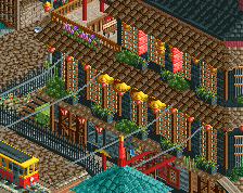
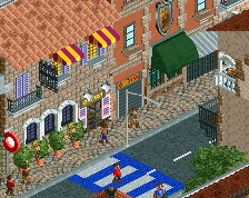
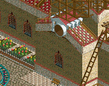
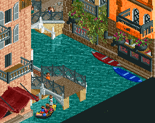
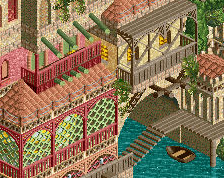
In the meantime, this is one of the most recent bits of progress at the border between the Dorsoduro and the San Polo districts. It's places like these that I'm hoping will contrast the derelict and ugly nature of the area surrounding the Thieves' Den:
Also, that's a very interesting idea, alex! I'll try to fiddle around with ways to add some storytelling into this project. Thanks for the idea!
Also, if there is anything else of concern I should know and improve upon, do tell! Thanks for the advice and appreciation again, guys!
the structures and general vibe is amazing. details are great. but the colors are all the same! chuck in some orange roofs, green/blue/tan/brown walls, etc. venice is so colorful! use it
Absolutely brilliant!
Ziscor, you can freeze staff to make them static.
I know it's not me you're talking to, but how do you do so? It would be interesting to know it and potentially use that.
It involves using the console in Open or using trainers in vanilla.
This is great! Really glad to see you're making this progress here.
It's really promising, but of course there are some things that still could be improved in my opinion: the first thing are the textures... I think mud everywhere is really not that of a great choice here. The brick approach you've made with that new white building overthere looks really great. Would be nice to see that more in that area. Also (looking at the Real-Life Venice and not the AC II one, because i'm not remembering the AC version) some stone walls replacing the mud would fit much better in my opinion.
The second thing are the roofs. I can definitely see why a game like AC II has flat roofs, that are close to each other, but that doesn't works in RCT aesthetics in my opinion. Especially the towers, looking at Venice towers in RL like the tower at St. Mark's Square, are needing more steeper roofs for my taste. Also some other colours could brush them up a lot!
At last i also have to agree about the things pointed out about lifeness in this. I feel like it would be wasted potential to just recreate the architecture without adding something moving or storytelling to it. People on the streets, gondolas, other small details or even rides could do a lot! You'll have to make a decision overhere between creating something phenomenal and mind-blowing or just good recreated architecture.
Looking forward to see what path you'll go with this! Keep up the great work!
I like it, but it looks flat. Something about all the same rooves/colors and the abrupt shoreline with a flat underwater. Add that to the fact you can't really see the base of buildings/path and the illusion of three dimensions gets blurred.
I haven't played the game this is based on, and while it's clearly very, very skilled work, in the context of RCT it does look a little repetitive, colour-wise. I think another shade or two for both rooves and facades would do this good, make it more lively, even if it's a step away from strict accuracy.